Sunday, 20 December 2015

Whitworth Gallery Seminar Discussion


In this seminar we discussed the exhibitions at the Whitworth Gallery in Manchester. 

One piece of artwork we looked at was Nathan Coley's "Gathering of Strangers". 

Add caption

 After thinking about how the work could be interpreted (it could describe the condition of the gallery situation - how strangers gather at the gallery to look at the work) we looked at how the context changes the interpretation of the words, and the link to Christian congregations - the places where Nathan Coley's "Gathering of Strangers" sign becoming 'camouflage churches'. We also considered how the social context shifts the meaning. 

Another piece of work we looked at was "Myselves" by Do Ho Suh. This piece of work was made of thread 'drawings' embedded within the paper, which gave an interesting effect:


The next artworks we discussed was "Rainbow Girls" by Ghada Amer, which addresses issues around gender. Amer purposefully adopts embroidery as the medium for the creation of the work to subvert gender roles/stereotypes. There are links to Islamic culture in the work and also phrases borrowed from feminist text.


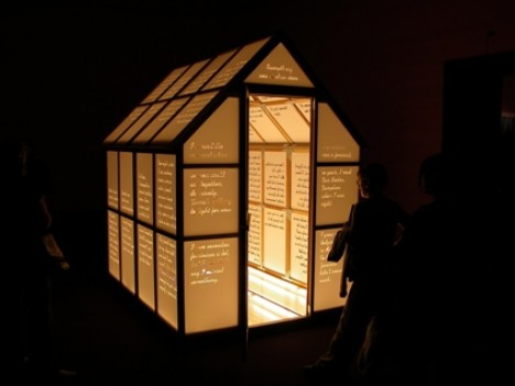
Another work that also borrows from feminist text was an installation piece of work by Mary Kelly, an illuminated greenhouse with walls inscribed with feminist messages. 


Thursday, 17 December 2015

Analogue Communique Session 3

This type workshop was all about scaling up our letter designs even larger with a focus on creativity and the process of creation - what tools/materials would we use to create our ' I am ....' statement at a larger scale. Although this was the case you could stick with what you had done in the previous sessions but just on a bigger scale which I decided to do. 
At the start of the workshop I decided to recreate my previous design on A3 white card instead of black card which I had used for my last design as I wanted to try on both white and black. Part way through working on the white card I realised my letters worked better on a black background so I then took my original letters on Black A4 card, scanned them in and scaled them up to A3 size, which I then printed.

My scaled up letter designs seen here:


Although I am pleased with how the letters look on a larger scale I would like to try out some other ways of creating my type like using different materials and exploring more creative ways to see what kind of outcomes are produced.

'
'
Following on from this session I found a book in the library called 'Handmade Type Workshop' by Charlotte Rivers which includes step by step instructions for different handmade techniques to use to create interesting type messages, as well as showing different typographers' work.


I found this book really interesting and it has given me ideas to try out as well as giving lots of hand-made type inspiration through its chapters, each of which focus on a different area of hand- made type, such as Illustrated or hand drawn type, 3D/Installation type, Found or photographed type, printed stitched or cut type and creating a font family. I intend to try out at least one technique and apply it to my 'I am...' phrase and also maybe apply it to another word or phrase.


Thursday, 10 December 2015

Corporeal Text - Time, Aesthetics + Composition

In this lecture we started off by exploring the question 'How do we evaluate writing?'. 

Areas of study (gap analysis by Michael Biggs)

One response was: in more strongly 'fact' based discipline - experimental design - creativity - hypothesis -CS Pierce Abduction and Semiotics. 
'
'
internal relational coherence

'
'
relations with the world (through data acquisition)

--------------------------------------------------------------------------------------------------------

Another response we looked at was in the area of Cultural studies/humanities. 

- what is it to 'explore the intensities of the situation' (Deleuze)

Barbara Bolt and Elkins quotes - talk about the process of beginning to paint - comparable to the start of the writing process. An essay has context but also interpretation - interesting , pervasive, coherent, enlightening, constructs a way of seeing

Inter - relate
        - fere
        - pret
        - est

Thursday, 3 December 2015

Cereal Packaging - Printing, Making and Photographing

This was the final session on our cereal packaging and the focus of the workshop was printing out our cereal box net and then photographing the box. My work that I brought to the session was ready to be printed, I just had to remove some red outline boxes I had used as guides. Below is the artwork file that was printed. 

To do this we had to save our Illustrator work as a High Quality Print PDF and then place it on an InDesign file in a layout set up for us. We then waited for our work to be printed out on card.


Once our nets were printed out we were instructed to cut out our work and score the edges of the box that would need to be bent, and then stick the right edge together to form the box shape. This bit was a bit tricky for me as the box would not stay stuck together even with glue and double-sided tape, but managed to hold together long enough for me to photograph.

Here is the finished box photographed:


Overall I am really pleased with the way the cereal box turned out and think the design and colours both work well and I think my work has translated well from screen to printed object.

Barrett & Bolt

Considered first in this lecture was an idea from last week which was ' stop thinking about epistemology - think about performativity and ontology instead'.

The performative act doesn't describe something but rather it does something in the world. This 'something' has the power to transform the world.
  '
  '
  '
 emphasis upon process, materiality and social/perpetual change (a kind of art-activism) blurs the epistemological and ontological.  - extreme/qualitative, participatory forms of research - does not separate subject and object.

'
'
'
Bolt, following Brad Haseman has suggested that a focus upon tacit, embodied and material centric forms of knowledge might provide the grounds for the formulation of an alternative, discipline specific paradigm that might be positioned as the main concern of artistic research.

- Bolt and Barrett try to document a paradigm shift in ways of knowing.-> standard research proposal - reading, writing, arguing
-working with the world as opposed to trying to measure it.

Epistemology:

Tacit, rather than explicit
knowledge - knowing how rather than knowing 'that'

con: all very physical/ 'hands on apprenticeship' uni against.

Borgdoff and Actor Network Theory
'
' invokes the idea of a paradigm shift BUT only in a university infrastructured sense. 
- i.e. as building a framework or institutions, organisations, pubications, conferences, government bodies, and funding agencies.
'
'
' Actors in A.N.T can be human and non human. 
  ' 
  ' e.g. Laurie Gries uses A.N.T to chart the life of Shepard Fairey's Obama Hope image.

Thursday, 26 November 2015

Line Boiling and Hand Drawn Elements

In this After Effects session the focus was on 'line boiling' which is a mix between animation and motion graphics with an emphasis on visual content, not craft. Line boiling is a technique where you have a series of images, always an odd amount because of perception when looking at the images- otherwise it doesn't work and looks like a flicker or mistake.

For this reason we were asked to hand draw the same image three times by tracing the first over twice and then scan these in to use our assets. For this session we also needed a piece of copyright free audio to go with our work. I chose an instrumental piece of audio which I felt worked well with my image.

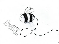
These are the drawings I brought to the session:


Once we had our images scanned in we had to set them up in Photoshop at 72 dpi, and crop them making sure they were cropped to the same size. I also cleaned my images up a bit using the Curves tool and using the same output and input numbers to make sure each image looked relatively the same. When saving our images it was important that we saved them like this:

Name_001.jpg

We then opened up After Effects, setting up a new comp with HD settings and changing the frame rate to 25 fps, and the duration to 10 seconds. The first thing we did was import our audio file. We dropped the track in to the timeline and then edited and cut the track to suit. 

Then to get our footage we went to the Project Menu - File - Import File -  then navigated to our material. We then selected all 3 images by holding shift, and imported these as a JPEG sequence. We then dragged the footage to the timeline, but as the footage was only 3 frames long we changed the setting to loop and fit. To do this we went to File - interpret footage - main, changed the frame rate to fps 25 and changed the loop setting to 50. 

This is known as 'animating in  twos' which means 2 frames per second ( animation speed not frame rate)
We then accessed the timeline options, columns, stretch and changed the speed to 200%. 

After this we imported a texture for our background, I chose a subtle paper texture for mine. We could also animate our images to move by dropping a key frame at the beginning and end. Also to make our image look like it was on whatever texture we had chosen (paper in my case) we went to layer modes and changed the 'normal' setting to 'multiply'.

We then covered a technique which makes it look like a line is drawing itself. To do this firstly we selected the pen tool and drew around the shape of the line we wanted to make look like it was drawing itself, drawing from left to right as that is how something would be drawn naturally and leaving a gap in the outline. We then went to the Effects menu and selected 'generate stroke', selecting the 'all masks button' and where it says colour we chose one different to anything used so far so it could be seen. We then had to make the brush size cover all the lines so it fits all the lines on each image.

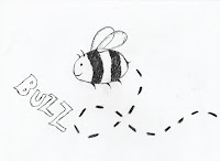
Next we animated the lines and created the mask. We changed the 'end' value to 0% then activated the key frame, dragged the playback head to wherever we wanted the image to be fully drawn and made this 100% on 'end'. I added this effect to my word 'buzz' but did not add it to the final clip because I had not done the word as a separate JPEG file, so when I played it back the effect worked, but my bee image had disappeared.

The final technique we looked at was how to apply a 'fake boil' effect using Illustrator and After Effects, we tested this by creating a simple shape on Illustrator and copying this in to After Effects. Then to add the fake boil effect to shape layers you go to the drop down contents - add  - wiggle paths. I didn't really like this effect though so did not include it in my final clip, I didn't find it looked very effective or added anything to the animation.

Here is my final outcome of the session:


Boiling from Libby Howker on Vimeo.

Christopher Frayling - the problem of research in art & design: continued

Following on from the previous one, this lecture looked at criticisms of Frayling: What sort of research is Frayling himself conducting?

'
'
'
Frayling underplays and to some extent misrepresents 'action research' - the type of research that sits most readily with the artwork that speaks for itself.
'
'
' Frayling actively constructs the debate - sets down the terms and performs it in to existence 'The Rhetoric of Reseach' (Biggs, 2002)
                                        
- Following Stuart Hall's Constructivism, Biggs suggests that Frayling constructs the concept as opposed to describing it.

- He brings the categories of 'in', 'through' and 'for' in to existence.

It is work arising out of Frayling's category of Research For art and design that come in for so much criticism (largely by the design community).

-the work itself can be the method

We lastly briefly looked at Griselda Pollock - artist, sociologist, feminist theorist -
Clash between knowledge and performance

Saturday, 21 November 2015

Lupton: Subliminal Seduction

In this lecture we first looked at Lupton's post-modern interest in hermeneutics (interpretations) and structures of social control, which would lead us to believe her to be receptive to the idea of subliminal advertising, however her argument is largely critical - but still thinks it locates an important truth.   
  
                   ***

The critical phase of Lupton's argument:

- The idea of subliminal advertising involves reading an image in a certain way

- Lupton notes connection between reading ambiguous images and the wordplay of advertising (puns, compressions, double meanings) post-modernists are interested in the idea of double coding

- Early cinematic 'blipverts'(intermittently flashing imagery on a single frame of a film) were said to increase concession sales- but that this could not be repeated under experimental conditions. 

Stuart Ewen's All Consuming Images: The Politics of Style in Contemporary Culture

The positive phase of Lupton's argument:

- There are subliminal effects of advertising -> in truth this is an issue of representation -> representations of ethnicity/class/femininity/ etc
|
|
representations of cultural normality are transmitted in a quasi-subliminal fashion

- the myth of subliminal advertising ultimately cheapens the valuable critical and semiotic deconstruction of the representation of societal norms and power interests as they are encoded in images of media

- 'Mintel' report

-'Seducing the subconscious: The psychology of ...' - Robert Heath

- Compare the Market vs Go Compare

- the curious case of O2

- Affect vs representation

Thursday, 19 November 2015

Analogue Communique session 2

Following on from the last session when we wrote out our 'I am ....' statement in different styles and fonts, this week's focus was now scaling up our letter designs so each individual letter was on an A4 sheet and also to experiment with different ways of creating the letters if you didn't want to carry on just using pencil and paper. 
In this session I began by using the layout sheet from the previous session but colouring in the squares black, and writing over in white water based marker to see the effect on a black background creating a 'negative' effect of my letter designs done on a white background with pencil. 


Here is the finished design:


I then took these letter designs and began scaling them up, drawing each letter again in pencil on an A4 sheet of black card, then colouring in the white areas with white pen. This was quite difficult as the pen tip was quite small, so ended up running out quite quickly. A second pen also ran out which meant that for the last few letters I had to use white oil pastel, which I found harder to be neat with when drawing the letter outlines, but the effect wasn't too different. 

Here are the all the letters drawn on A4 sheets spelling out the message:


I am pleased with how my letter designs look scaled up and think they work well on a larger scale, I think it was a good idea to try out my letter designs on black paper as I think the effect of white on black looks quite good.

Monday, 16 November 2015

Christopher Frayling - the problem of research in art & design


We started off this lecture by looking at Frayling's lines of argument. One of which being that research = old territory - correlative cliches and stereotypes. An example was given as the case of Picasso, as he was interested in visual intention aimed at producing a work and did not feel comfortable verbalising work, showing that the artist isn't interested in the business of unambiguous (objective) communication and the artwork is expressive and a new work is about personal development. 
A second line of argument covered was looking at research as process, 'pragmatic' - correlative cliches/ stereotypes such the cinematic portrayal of 'Artist'. One example given was 'Lust for Life' a film made in 1956 about Vincent Van Gogh played by Kirk Douglas, and then discussed was how there wouldn't ever be a popular film about a non-expressive artist like Mondrian because there needs to be 'insanity'. 


Following on from this the stereotype of the designer was covered. We started by considering the pre-1980s 'Designer Boffin', which had a strong presence in war and sci-fi films. Here, designing = pragmatic doing, an almost 'designer scientist'. We then looked at the late 80s designer = (product of style TV shows - satarised by Chris Morris and Charlie Brooker in the TV series 'Nathan Barley'. Designers portrayed as style obsessed, considers images, styles and signs and always in search of the latest thing. 

Discussed next was the portrayal of research scientists - the fictional scientist presented as deranged, diabolical, 'over reaches', examples being Dr Faustus, Jekyll, Frankenstein (sinners) or the saints presented as critical and rationalists - real-life scientist, humanitarian, logical, clarity -> the critical rationalist stereotype has been attacked in the last 30 years. 

Frayling's Three distinctions of research, 1993

Research (in to)

Art + Design
Close to humanities, historical or aesthetic research. All about concepts.

Research (through)

Art + Design
Applied research in to materials. Diaristic account of studio experimentation.

Research (for)

Art + Design
Picasso regards as 'thorny one'. Work intended to speak for itself.

Frayling terms 'Actions Research'.
End product = artefact and documentation of process/influence as well as reflection on process.

Monday, 2 November 2015

Cereal Packaging - Designing

In this session we took the sketches we had done previously of different possible designs for the front of our cereal box, including our character, cereal name and bowl of cereal. 

Firstly when we had scanned in our sketch we cropped it and altered the levels so that we had a good quality scan to work with. In Photoshop we then duplicated the layer with the scan on, and set the top layer from 'normal' to 'multiply' so that the sketch lines looked more defined and darkened. We then saved this file as a jpeg.


After this we opened up Illustrator and set up an A4 landscape document. We then used rulers to create a rectangle that would be the correct size for our scanned sketch of the front of the cereal box to fit in, the width being 70 mm and the height being 105 mm. We then placed our scan in the document over the rectangle. 

Once we had done this we then created a new layer for the net to go on. We placed the net file on the document and sized it to fit the rectangle, subsequently deleting the rectangle layer as it was no longer needed. We then drew the outline for the net. From this point we had to use the pen tool to draw round our scan art and then think about designing the rest of the cereal box.


At first I decided to use to first design that I had sketched out as I thought the necessary requirements for the box (character, name of cereal, bowl) were all laid out quite well, but as I began to trace over the scan art on Illustrator using the pen tool I found that the design didn't look as I thought it would and also the felt the colour palette I had chosen wasn't working. Here is the design that I first started to create:


Then after having a few weeks between the second and third session I decided to start again with creating my cereal box, changing first the sketch design for one with a better layout. I also decided not to draw round the letters using the pen tool but use a heavy, block font so that it would stand out and be easy to read. On the second design I also chose to use an image of a real bowl of cereal and not one drawn on Illustrator as I felt this made the design look more authentic, also to work with my chosen cereal name of 'Oaty Owls' I Photoshopped an image of some porridge in to the bowl and spoon image I had found. As well as this I decided on a new colour scheme featuring brighter, bolder colours and keeping to a few colours. 


 I chose this design variation to work with in Illustrator instead as I liked the owl character perched on the spoon. I went through the same process for creating my second cereal box design attempt like using the net template as I did for the first design. 

I made a few changes to the sketched design in Illustrator such as changing the cereal name to Oaty Owls and removing the tree branches, but kept the overall layout of the different components the same. 


I am much happier with the way this design turned out and think it works much better overall with improvements to the colours and also using fonts that were not drawn by the pen tool, as well as the owl character being much better drawn this second time round I feel.

Rotoscope in After Effects


For this session we needed to bring two things to the session, one being a short piece of copyright free footage that looped and we had to make sure the subject of the footage was not obscured as we needed to cut out the whole figure for the roto scoping. We also were asked to prepare a background created in Illustrator for the subject of the footage to feature in. 

I found it quite difficult to find a suitable piece of footage that was copyright free even though I looked on multiple websites. I ended up with a looping video of an antelope/gazelle type animal found on a royalty-free footage website although when I downloaded it still featured a watermark so to rectify this and to avoid copyright issues I filled in animal figure using the track mat feature to change the work.  
For the background I created a desert/grass plain landscape, and added in a tree and some water as I wanted to place more animals in the setting to make it more interesting which I may still do if I can find suitable royalty free footage.


In the session we were shown an example of rotoscoping (rotoscoping is an animation technique in which animators trace over footage, frame by frame, for use in live-action and animated films) used in a Kylie Minogue music video where multiple version of her have been essentially 'cut out' and placed in the same background/setting. 


The first thing we did was import our footage as mine was a video I imported 'as footage'. We set the frame rate to 25 fps and made the video have a 2 second duration. To do this we had to slow the footage down and stretch it by going to Paragraph- column- stretch and changing the value to 200.

We then had to pick which frame would be our first one when rotoscoping, something where all the limbs had been extended and were visible was suggested, we then had to press the star key (*) to mark this layer. After we had done this we went to the After Effects drop down menu at the top and went to preferences- general- then unticked the 'preserve constant vertex and feather point count when editing masks'. This mean that we could now alter the points on each individual frame and therefore have greater accuracy in cutting the subject out.

We had to the begin drawing round our cutting out our figure. We used the pen tool for this, and selected the layer, moving the playback head at the star marked point, and were instructed to try and use as few points as possible around the shape. This part was quite time consuming, and difficult at times when the limbs were crossed over for example.

We then looked at mask tools and functions. We went to the mask option, drop down menu where the 'add' option would remove the background and the subtract option would do the opposite. We then selected the animate mask property and selected mask one, activate mask path.

We then saved the project and went to the mask selection and chose add. Then we selected on the mask path and held down the control key and clicked on any frame. A drop down menu appeared and we selected 'toggle hold key frame'. This meant the subject of our footage was now able to be placed in the background we had created. Next we created a new composition with a duration of ten seconds, which was the composition from which we would then be able to output the video. Firstly we dragged our original composition in to the timeline, then imported the backgrounds we had created previously. 

To make our rotoscoped figure loop within the 10 second comp we used time remapping. To do this we selected layer - new - time - enable time remapping. We then added a new key frame and added an expression to loop. We used the expression dictionary and selected menu- property - loop out - duration. This allowed us to extend motion for the duration of the timeline. The final thing we looked at was using track mats to add colour/texture to our rotoscope figure, making sure the colour/texture sat below the rotoscope layer and was the size of the comp.

Overall I found this session quite challenging and managed to keep up with instruction only by writing down everything as it was said so then I could refer back to it. I think the techniques we learnt were quite useful although I prefer the rotoscoping in Photoshop session we did last year as it seemed more simple than doing it on After Effects. As for my outcome I am fairly happy with how it turned out but would maybe like to have tried making it so the animal figure looked as though it was walking across the landscape, not just in the same position over and over.


Sunday, 1 November 2015

Emigre Magazine

The focus of this lecture was mainly the design magazine 'Emigre' which ran from 1984 to 2004, but we also looked at Octavia magazine also.

* Emigre magazine focused on typography
* look at relation to Octavia magazine
* leaning towards post modern in Emigre and modern in Octavia
* look at aesthetics of each


The founders were Rudy Vanderland and Zuzand Licko. The original intention was "liminality" - "In between cultures".

Emigre was also a type foundry and focused on typeface development.

Critics:

* Neo-modernists -> Massimo Vignelli - "A national calamity" 
                                                          - "An abbreviation of culture"
* Stephen Heller (middle-ground) - "A blip in continuum"
                                                     "cult of the ugly"

*David Carson (post modernist) - designers who had once championed their work for aggressiveness began to condemn it as too readily identifiable, and therefore unusable. Ironically Carson popularised its style.
 

-  


The aesthetic of the magazine was artistic and punk - engage/involved in the forms, playful experimental texts.

What is so distinctive about Emigre?

* Plays out a political debate but by focusing upon formal design design issues e.g type and composition.

* Technological effects on page design - reflected political and social shifts in art, culture and mass communication.

* Destablised a post-war design ethic of 'righteous form' that was built on rationalism, minimalism and modernism.

* Contested universal graphic vocabulary built on grid systems adapted by corporate culture.

* 'Provocative clutter'

We then looked at Old Modernism (respected) vs Modernism 8.0 (negative views on this)

Emigre was famous for it's letters to the editor - emphasis on engagement with audience.
 *It's last few issues focused on writing. 

* The magazine had lots of format changes

The founders of the magazine declined to be interviewed for Gary Huswit's 'Helvetica' film.

The magazine informed generations of designers and academics.

Octavia magazine ran concurrently to Emigre. It was concerned with typography and layouts were hand-crafted things.


Friday, 30 October 2015

Redacted First Things First Manifesto

In this seminar we looked at Ken Garland's 'First Things First' Manifesto which was included in the 'A Conversation' studio brief notes. The first thing we did was, while reading through the manifesto, annotate and analyse the text and the message of the work. 
What I gathered from reading the manifesto was a critical, somewhat cynical view of the way in which a lot of design is done for the sole purpose of commercial products and an uncomfortable feeling towards designers who just design trivial things for commercial purposes as they are just endorsing consumerism and the manifesto states there are more 'worthy pursuits' that should be considered when using our design skills. The manifesto's message seems to be a move away from consumerism lead product marketing to design projects that have 'more meaning'.
After this we had to think about redacting the text to create our own manifesto, so editing out the parts we disagreed with and leaving parts that would help get across what we believe about design. At first I was unsure which bits to leave and which to keep but after rereading the text a few times it became easier to do. I have done two different redacted versions, the first one is quite short and states the purpose of a designer and what they do. I edited out quite a bit of the text to get away from the message of the original and came up with something that is kind of a straightforward statement about design. 


It reads: 

Design


We, designers, have been raised in a world
of books and publications.

Designers apply their skill and imagination to work for things.

Designers devote their efforts to changing the very way in which citizen-consumers speak, feel, respond and interact.

Pursuits demand our attention and help.

We propose exploration and production and perspectives expressed through the visual.


The second redaction of the manifesto that I did opposes the message of the original as I don't really agree with its tone and stance on designers almost 'selling out' their skills to consumerism and product branding as I find it quite patronising to assume that these things aren't 'worthy pursuits' just because they aren't necessarily changing the world drastically or furthering some charitable cause.

Here is the second redacted manifesto I created:


It reads:

A Design Manifesto

We are graphic art communicators who design and use belief,
Skill and imagination, diamonds, cards, light, always in large measure.
This is how time and energy is used best.

Uncomfortable designers devote their efforts to marketing and endorsing
a message that is to some extent harmful.

The worth of our skills and design projects and expertise challenged by the 22 visual communicators, their message we expect that no more will be taken to heart.


Although it may be hard to make sense of, due to the restrictiveness that only being allowed to take away and not add creates, I hoped to challenge the original statements in the First Things First manifesto. 

I found this task quite interesting as it made me consider the ways in which new messages can be made from already present texts and made me think about my own thoughts on design.

Thursday, 29 October 2015

Claims to Expanded Practice

In this lecture we started off by looking at how the animated cinema 'spills out' in to the real world, and so too does design.

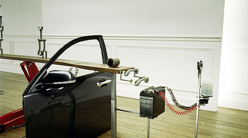
We looked at Johnny Hardstaff who creates experimental work and music videos, and also tv advertisements, one that we focused on was an advert for Honda called 'Cog'. It is cited as a landmark advert and a new genre of advertisement. It focused on small movements of everyday existence and a move towards a calmer, quieter form of advertising, making a change from the full on aggressive advertising and shifting towards synthetically natural to evoke a childlike sense of wonder.


We then considered 'What is Graphic Design for?' by Alice Twemlow. 

- a type of language - communication. 
- can be about creating nuances and also for everything graphic design is pervasive and invested n all parts of social life. 
-sustainability in graphic design
- return to immediacy
- fighting against ideas of simplicity - modernist ideas

Can Art and Design be taught?


In this lecture we looked at types of knowing, the work of James Elkins, and focused on the question 'Can art and design be taught?'. 

Covered first was the Higher Education Act introduced in 1991, which joined together universities/polytechnics/colleges to form a collective of 'visual arts'. 
The 'noise of different perspectives' was mentioned and questioned as to whether this was a good thing or not.


We looked at James Elkins' book 'Why art cannot be taught', and how Elkins thinks art is an irrational practice. One example used was 'The Crit' as a mode of assessment. Elkins says that the irrationality of crits epitomises the irrationality of art teaching (and artistic practice). Also the crit can be seen as a form of 'psychodrama' - formation and negotiation of tutor opinions - emotionally charged - options - positive mediation - less serious
                                             - silence
                                             - confrontation


Also mentioned was how art can't be taught because it is subjective, nothing rational to be taught. However other views are that art can be taught but few students become outstanding artists - 'great' artists have dropped out. Mediocre art can be taught.

What can be taught?

- Criticism/theory/philosophy
- Visual acuity (Bauhaus)
- Technique -------------------------- art teaching is actually directed                                                                       towards the reasons that we value art -
                                                          complicated questions of expression, 
                                                          control, self, knowledge, meaning
- how to get along in the world of art


Overall I found this lecture interesting as the question of whether art/design can be taught is something I have actually thought about myself, as I have often considered how some people seem to be naturally creative compared to others and have 'an eye' for design which cannot always be taught as it is almost an innate thing, and although the process of design can be quite logical, the practice of art/creative disciplines, as Elkins says, is quite irrational and subjective - which makes assessing work difficult sometimes because of the subjective element. 

Thursday, 22 October 2015

Interdisciplinarity, Transdisciplinarity, Multiplicity and Pluralism

The books we looked in the lecture were Carl Disalvo's Advirsary's Design and Tony Fry's Design as Politics.

Carl Disalvo is interested in design activism " Agonist Pluralism " -> Cacophony of voices that functions as the ground of democracy -> design activism film " This is what democracy looks like "

One example of activism we looked at was The Suffragette movement lead by Emmeline Pankhurst in 1858 - 1928. 
-graphic interventions
-media spectacles
- protest displays

"Noisy Pluralism"
Million Dollar Blocks Project - Data Visualisation Heat map - a metaphor of noise- heat, social identity is driven by raw material vision of how we get to identity driven by difference.
Idea of heat map -> contemporary way of data visualisation

"Multiplicity" -> Society built on noisy foundation

Tony Fry:  makes distinctions between politics and the political. Design is in the service of politics.

Democracy is a representational idea -> takes noise of culture -> minimised through investment of people -> one voice to represent all.

All noise lost through one voice.

Listens to grass roots of noise through data visualisation maps. Design tames noise but also can reveal it again.

Multiplicity: Noise in society
Pluralism: Recognises differences between people through idea of representation

Two other books mentioned were:

Daniel Bons' Twentieth Century Multiplicity
Sanford, Kintess' Architecture of Time

Henry Adams coined 'Multiplicity' - "Vertiginous unmooring of existence"
                                                  - Talks about new way of thinking

At the level of politics multiplicity ultimately falls out of favour with the onset of WW1 (pulling together). 

Thursday, 15 October 2015

Histories of Graphic Design

This lecture was like the histories of animation lecture as the focus was to look at the beginnings of graphic design. 'Histories' being used again rather than 'history' due to Tony Fry's statements that history is selective and affective and histories can be mined for new meaning.

We started off by looking at Meggs' History of Graphic Design published in 1985. This was the first time the words 'History' and 'Graphic Design' had been used together. Every history that follows on from this is like a footnote to this history. The work was continued by Alston Purvis in 2002 after Meggs died.  Work referred to as "ambitiously encompassing" but also limiting. 

Covered next was sort of a timeline of graphic design, mentioned first was Lascaux cave paintings from around 15000 - 10000 BC. Then mark making, painting and writing invention. We also looked at the Hittite cylinder seal - a precursor to print and a Greek invention from around 1650 - 1200 BC. After this came the illuminated manuscript in AD 500 - AD 1000.
We also looked at the following:

- Evolution of printing and type
- Aesthetic and technical aspects linked also a social element
- Reason for being -> commercial
- Started in mid 19th century and progressed to different styles
- Arts and crafts, Art Nouveau, Vienna Secession, New Objectivity, Modernism, New Typography, International style, William Morris
- Peter Behrens - New Objectivity 1901, start of modern form
- Jan Tschichold - New typography
- International style -> Armin Hoffman

Also we looked at how the Helvetica 'craze' is technically a retro movement and how in Gary Huswit's 2007 film 'Helvetica' when he states that the font is everywhere to think about that and think whether it actually is and to consider that by him saying it he actually creates the movement.

Meggs' history is limited because ....

When Meggs entered the 80s and 90s, the dawn of the digital age, he ran afoul of the new generation of anti-modernists that had embraced the expressive and connective potential of new techniques. It is a difficult history to manage.
Early editions of cover of the book are full of visual historical cliche - the modern versions being better:


Following on from Meggs' history we looked at Stephen Eskilson - Graphic Design: A New History which was published a few decades after Meggs.

How did it attempt to be new?

The profession of graphic design was established when the task of designing printed material was separated from the task of printing it. Graphics as a function of the western industrial world.

* Stresses social context -> attempted to convey a message of cultural 'improvement' - novel form of exhibition.

* Covers period that Meggs left off - impact of new technology

* Idea of 'citizen designer'

Criticism of Eskilson:

by Alice Twemlow and Lorraine Wild - "There is a lack of interest in anything that graphic designers write"

Beatrice Warde - The Crystal Goblet ,1930, - modernist book

Malcolm McCullough -> 'digital craft' as a blend of skill and intellect accompanied by by a blend work and play -> Marian Bantjes