Showing posts with label typography. Show all posts

Saturday, 23 April 2016

Analogue Communique - Further Exploration


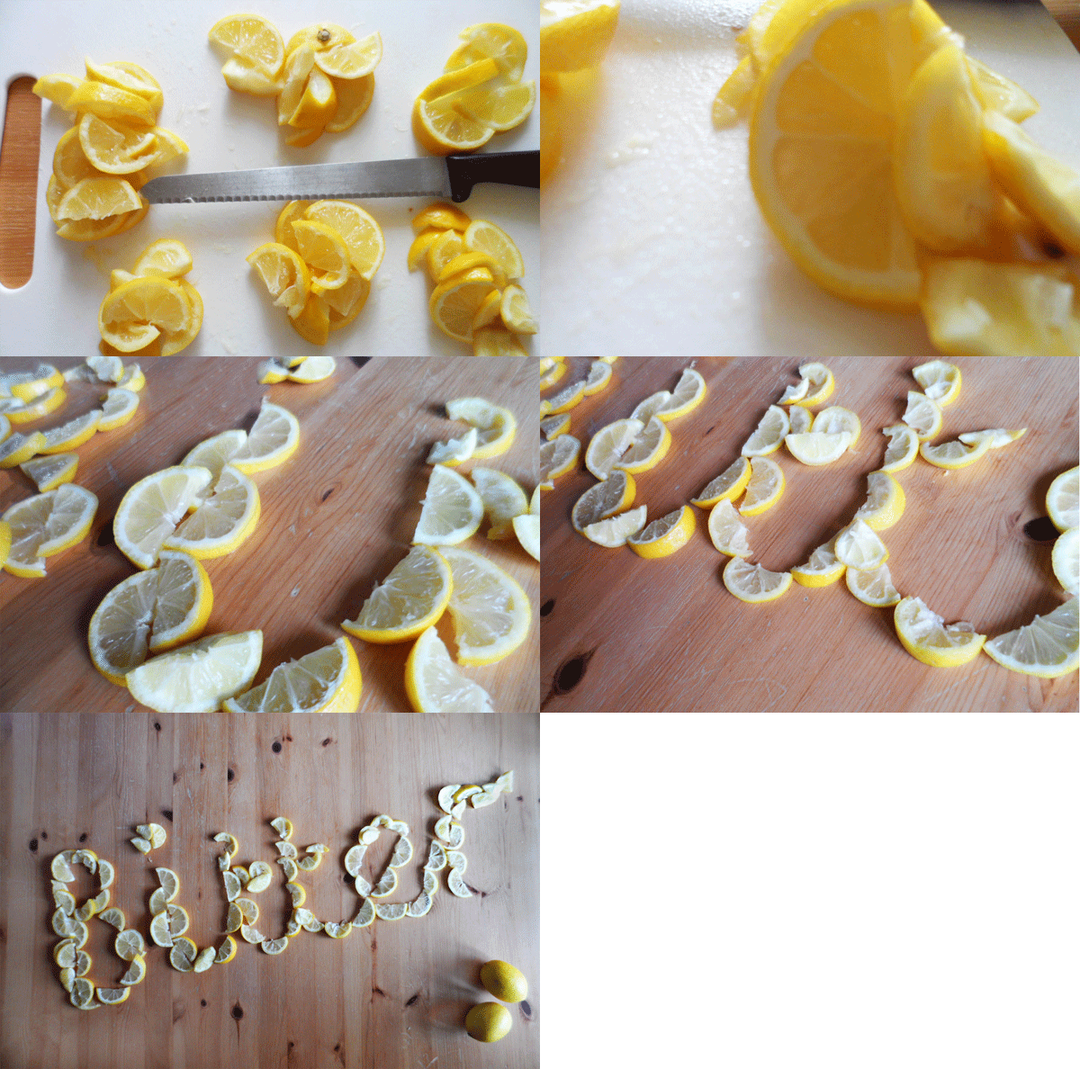
For my final 3D typography experiment I decided to try out one of my initial ideas using lemons to create the word 'Bitter'.


I created an animated gif to show the process consequentially and finally the final outcome.

 photo lemon-gif-f_zpszlszdfmd.gif


Overall I enjoyed the 3D typography workshop task and there are more ideas I would like to try out.


* * *


Taking my final outcome I then experimented with different coloured backgrounds.


Out of the two I think the black background works better.

Monday, 11 April 2016

Analogue Communique 3D - Further Idea Exploration


The second idea I decided to explore was my idea of having hair grips spell out the message 'get a grip'. Originally I wanted to get a more 3D looking type by using multiple heaped grips to spell out each letter but found I only had so many grips to work with, so overlapped instead where I could. I am fairly happy with how it worked out although I think letters aren't all level with each other and the design is quite simple which could mean the design looks boring although the message itself is quite bold.


I then created an animated gif on Photoshop, but rather than have each word flash consequentially one after the other I decided to make it so that the message would appear and slowly reveal the message by having the previous word stay visible when the next one appeared. To create this I used the timeline tool in Photoshop and exported out the gif for web use.


 photo get-a-grip-gif-long-retouch_zpsheugznh1.gif 

Analogue Communique 3D Development

Following on from the first workshop and looking at the ideas I generated I began to experiment and I decided on working with three ideas I had come up with: using lemons to spell out 'bitter' or 'don't be bitter', using hair grips to spell out the message 'get a grip' and using flowers to spell out the word 'grow'.


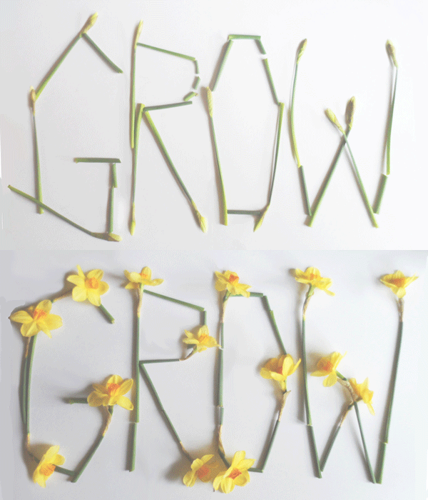
The first idea I tried out was the word 'Grow' spelled out using flowers, some which had bloomed and some which hadn't. 


I edited the photos that had worked out the best to make the light softer to create a gentler effect. From these I then created an animated gif in Photoshop, showing the pre and post bloom flower photos, making them seemingly 'grow', relating to the word the flowers spell out.


 photo GRow-gif-large_zps3hwmdzgk.gif 

Monday, 7 March 2016

Analogue Communique Development

Following on from last terms physical studio typography sessions, I found a book in the library called 'Hand Made Type Workshop' by Charlotte Rivers and thought it would be interesting to try out some techniques/ typography styles shown in the book and apply them to the phrase I had to create - 'I am...'. 

This is the tutorial I decided to follow from the book as I thought the use of the cut up squares of pastel coloured paper created a good effect, and also because it is quite different to the hand lettering I did for my work produced in the session.
.
.
.

.


I started off by printing out sheets of coloured paper, and then cutting out squares of a similar size.


This is the final outcome featuring my message I created in last terms session:


I like how the squares of paper give a pixelated effect to the letters and think the colours work well together.

Tuesday, 9 February 2016

Analogue Communique 3D

The objective of the brief for this term's physical studio process & production sessions is to create three dimensional typography to communicate a message. We are expected to be creative and think about how the meaning of the message informs the content and structure our creation. The output is to be physical and we are to record the build of our work and document all stages of our design process. 

For this first session the focus was on idea generation, and we had to create at least two ideas/possible solutions. 

To help with my ideas I created two mood boards of visual references:


From gaining inspiration from the visual references I acquired I then started to think about what word I would use for my creation, bearing in mind the materials I could use for the word, and how this would communicate a message. 

These are some of the ideas I had:

* Sharp made out of pencil sharpener shavings/ pencil shavings covering 3d letters made from cardboard
* Create made out of various tools for creating a piece of work
* Healthy made out of fruit/vegetables/food
* Sweet made out of confectionery/sugar
* Strike made out of matches
* Vintage made out of vintage ephemera 
* Get a grip/gripped/gripping made out of hair grips
* Explore made out constructed map paper
* Bitter made out of lemons/ lemon peel
* Stressed made out of thread/cotton placed in a chaotic fashion
* Recycle made out of recyclable materials
* Make made from tools used to make something
* Crafty made out of crafts supplies
* Grow made from flowers/plants

From these ideas I tried to think what word/message would be best and found it quite difficult to decide what was a good idea and what was not so good. Before the next session I will have tried out at least 2 of these ideas/ any better ideas I think of.

Thursday, 17 December 2015

Analogue Communique Session 3

This type workshop was all about scaling up our letter designs even larger with a focus on creativity and the process of creation - what tools/materials would we use to create our ' I am ....' statement at a larger scale. Although this was the case you could stick with what you had done in the previous sessions but just on a bigger scale which I decided to do. 
At the start of the workshop I decided to recreate my previous design on A3 white card instead of black card which I had used for my last design as I wanted to try on both white and black. Part way through working on the white card I realised my letters worked better on a black background so I then took my original letters on Black A4 card, scanned them in and scaled them up to A3 size, which I then printed.

My scaled up letter designs seen here:


Although I am pleased with how the letters look on a larger scale I would like to try out some other ways of creating my type like using different materials and exploring more creative ways to see what kind of outcomes are produced.

'
'
Following on from this session I found a book in the library called 'Handmade Type Workshop' by Charlotte Rivers which includes step by step instructions for different handmade techniques to use to create interesting type messages, as well as showing different typographers' work.


I found this book really interesting and it has given me ideas to try out as well as giving lots of hand-made type inspiration through its chapters, each of which focus on a different area of hand- made type, such as Illustrated or hand drawn type, 3D/Installation type, Found or photographed type, printed stitched or cut type and creating a font family. I intend to try out at least one technique and apply it to my 'I am...' phrase and also maybe apply it to another word or phrase.


Thursday, 19 November 2015

Analogue Communique session 2

Following on from the last session when we wrote out our 'I am ....' statement in different styles and fonts, this week's focus was now scaling up our letter designs so each individual letter was on an A4 sheet and also to experiment with different ways of creating the letters if you didn't want to carry on just using pencil and paper. 
In this session I began by using the layout sheet from the previous session but colouring in the squares black, and writing over in white water based marker to see the effect on a black background creating a 'negative' effect of my letter designs done on a white background with pencil. 


Here is the finished design:


I then took these letter designs and began scaling them up, drawing each letter again in pencil on an A4 sheet of black card, then colouring in the white areas with white pen. This was quite difficult as the pen tip was quite small, so ended up running out quite quickly. A second pen also ran out which meant that for the last few letters I had to use white oil pastel, which I found harder to be neat with when drawing the letter outlines, but the effect wasn't too different. 

Here are the all the letters drawn on A4 sheets spelling out the message:


I am pleased with how my letter designs look scaled up and think they work well on a larger scale, I think it was a good idea to try out my letter designs on black paper as I think the effect of white on black looks quite good.

Wednesday, 22 April 2015

Typography in Graphic Design - Task 3

For the third task we had to select the most appropriate design out of the three roughs and create a complete alphabet on graph paper. Here is my first attempt at my chosen design out of the three drawn previously, drawn on graph paper.


I used pencil and made sure each box for the letters was the same size, but when creating the final version in Illustrator I will need to make sure each letter is the same width and height for it to look like a proper font and for it to work well.

On Illustrator I used the guides and rulers to scale my letters more accurately and to make sure each letter related and fit well with each other. 


I used the pen tool to redraw my letters and also the ellipse tool,for the circular components of my typeface. 
Once I had finalised my design on Illustrator I experimented with different colour schemes inspired by El Lissitzy's 'Proun' piece, which my letters were transcribed from. 


Wednesday, 25 March 2015

Typography workshop


This workshop was all about creating an alphabet and creating our own font from drawing out letters in different styles and then picking our strongest letter designs to create a more consistent font of one style. We were also asked to think about what our fonts would be used for when creating our alphabets.


Here are my initial letter designs done using pencil:


From looking at these different letter designs I felt the ones that worked well and I liked most were the script/loopy type letters and also the ornamental/decorative type letters which were inspired by vintage typefaces I have seen, and reminded me of typography used to advertise a circus or fun fair.
I decided to do a full alphabet using the script letter designs and here was the result which I felt looked quite art-nouveau in it's appearance although this was not a conscious decision.


For this we did both lower and uppercase letter designs, and to make the font work and the letters correspond I tried to put a loop in every upper-case letter and then made the lower-case letters more focused on the curves of the terminals. 
Once I had created a full alphabet I then began to draw the letters on a larger scale using grids:


I found using the grids quite challenging as my letters feature lots of curves and loops which were quite hard to draw within the rigid grid format. 

Overall I enjoyed this workshop as I am interested in and really like hand-lettering and creating letter designs and fonts by hand, and found the freedom of the workshop nice to be able to create a font from my own inspirations and have fun with designing an alphabet without too much pressure on measurements being perfect, but also then thinking about what my created typeface could be used for, for instance my font is quite cursive so could be used as a title or heading font.

Sunday, 22 February 2015

Typography in Graphic Design - Task 2

For the second task we had to draw up three rough alphabets from our initial shapes and letter forms, and then think about which one will be most appropriate to take forward to task 3. 

Here are my 3 alphabets inspired by my initial letter forms transcribed from El Lissitzky's work. 


To create these alphabets I used a pencil and a ruler and then outlined in a black fine-liner pen. For task 3 I will have to choose the alphabet which I think the best, to do this I will select my best letter from the 3 designs, and will have to make sure each letter looks like part of the same typeface, and the designs of the letters correspond well with each other. Also each letter should probably be the same height and the line widths the same to make it look neat.


Wednesday, 4 February 2015

Typography in Graphic Design - Task 1

For this session we were asked to carry out a typographical task. Using references provided, featuring a variety of architects, designers and artists, we were asked to transcribe shapes from these to make letter forms and or typographic characters. The letters could be lowercase or uppercase but had to be a,n,e,s and g. We had to generate at least 3 different options from the image samples provided. 

The first image sample I used to transcribe letter forms from was Edward Wadsworth's piece 'Newcastle' which is a Vorticist piece of work. Vorticism was a short-lived modernist movement in British art and poetry of the early 20th century. It was partly inspired by Cubism.


Here are the uppercase letters I transcribed from this piece:


And the lowercase sample:

I feel the uppercase letters could reflect better the different elements of Wadworth's work and be more expressive as the letters are very basic. With the lowercase sample I tried harder to pick out shapes from the reference to turn in to letter forms.


My second typography samples were inspired my Milton Glaser's Dylan Poster Art - 1966. 


Here are my uppercase letters inspired by this piece:


As well as my lowercase letters:


I quite like how the uppercase letters look, but feel the lowercase letters could look better in terms of shape but I think that I have transcribed Glaser's work quite well here.

The third reference I looked at as inspiration was  ‘PROUN’ by El Lissitzky (1923). 

Here are my transcribed uppercase letters:


Here are the lowercase letters I transcribed:


I found that this piece lent itself quite well to formulating letters as it features many different shapes and angles, with a mix of curves and straight lines.

For my fourth typography sample I looked at a piece of work by Laurie Rosenwald. Although she already includes type in her work, I was interested in looking at the shapes and images to transcribe letter forms.


These are my uppercase letters inspired by this piece:


And my lowercase letter samples:


I'm not sure the letters I've transcribed from this piece work that well, especially the lowercase sample as the a looks more like an o, and although the uppercase letters all relate to each other and match up to Rosenwald's work quite well they're a bit basic and I could have probably produced more interesting designs. 

The fifth image sample I used was Herbert Bayer's work, I used both of these designs when constructed letters.


Here are the uppercase letters I transcribed from this:


And the lowercase letters:


Using this reference material to transcribe letters was the most challenging I feel, maybe due to the fact that I was transcribing images with a 3d perspective, but I also feel these letter forms are my most expressive and represent the reference material I used well.