Showing posts with label Theory as practice 2. Show all posts

Tuesday, 3 May 2016

Lev Manovich - Software Takes Command

* First 'theorisation' of After Effects (2013)

Manovich is a technological determinist 
- believes the technology that we produce determines our culture -responsible for collapse of disciplines

- software-centric not like others who focus on hardware and machinery.

Soft Evolution

- software = media - turning algorithms over data
- Hybrid media vs multimedia
.
.
.
multimedia juxtaposition everything, kept separate , interfaces sectioned off

hybrid media intermingling/integration - aesthetic of work - to do with combinatory approach

-Software simulates the media and the techniques for its manipulation
 - data structures (simularity)    - enables a kind of hybridity e.g. zoom out applied to a book
-Array - sound/video/text 
.
.
'softwarisation' all hardware techniques are moved in to software 'plug ins' (plug ins allow new algorithms to be applied) define new ways of manipulating data - many physical mediums can be combined in to one kind of data structure - different tools have different 'biases' but they also support opposing data types 
-bitmap - vector - photoshop -illustrator


- the idea of disciplines ignores the common features of all media and cultural production being done today which are the result of their reliance on the same technology. A small number of basic data structures (or formats) which are the foundation of all modern media software.*** - algorithms 'operate' on these structures - e.e. cut/copy/paste - some are 'native' to particular types - blur and bitmap, media specific commands - these produce very different aesthetic styles. 

- The implementation of media - independent techniques are structurally similar to various aesthetic systems in art that were not limited to a a particular medium: for instance, baroque, neo-classicism, constructivism, post-modernism, remix as well as vernacular aesthetics and professional/commercial aesthetics. Each system manifested itself across media. Thus, baroque aesthetics can be found in architecture, sculpture, painting and music, constructivism was applied to product design, graphic design, clothing, theater and film. 


***  parametric design - specify diversity in how something appears

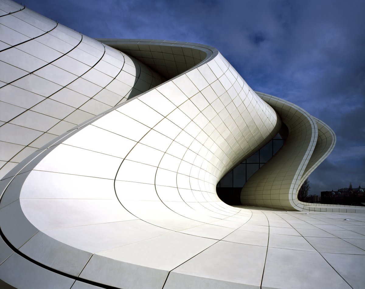
the idea of this comes from software manipulation according to Manovich. Styles influenced by architecture, examples being the work of Zaha Hadid.


One parametric design - fluid distortion as something changes over time

Wittenstein - 'family resemblance' 

is parametric universal design? modernism?

Is computer 'meta-medium' - overarching
               or ' collection of simulated ....'
               or 'mono-medium'

Think in terms of ecosystems of bitmap, vector, etc. After Effects as ecosystem.

Media Design (software in action)

- "We shape our tools and there after our tools shape us" - Marshall McLuhan, (1964)

Languages of design, cinematography, painting, animations, typography, all meet within the computer. After Effects was introduced in 1993 at center of this transformation. After Effects characterised by 'deep remixability' 

- visual, spatial, temporal - diversity of new forms

- all of history open for pilfering but through vernacular means - vimeo, youtube

- 1960 -'Motion Graphics' term coined in company name (John Whitney)
:
:
focus on animated typography and type/abstract image integration .


-Evolution comparative to Velvet Revolution; not a big bomb going off but an insidious, underground effect. 
:
:
result of Velvet Revolution is a new hybrid of visual language of moving images in general. This language is not confined to particular media forms. Present in both narrative and figurative sequences and films. 

-move away from realism ( contra to early CGI)  move from time based to composition based. 


Louise Bourgeois


- Taken up with Feminist historians.
- 'Femme Maison' - 1947
- Work on paper always been as important as sculptures
- She writes as well as draws
'He disappeared in to complete silence'
- Surrealist text

'The Insomnia Drawings' 1994 - 1995
:
:
Considered keystone of her work, not doodles, kind of conscious 


turns insomnia in to art, doesn't drown in insomnia


Saturday, 30 April 2016

Page 1: Great Expectations, seventy graphic solutions

I took this book out from the library as it was on the recommended reading list, and also because the concept for the book sounded quite interesting: seventy designers were all given the same task- to lay out the first page of Charles Dickens' Great Expectations. The instigators of the project (Lucienne Roberts & Rebecca Wright) stated it as an opportunity for the designers to challenge the conventions of book typography, or to work within them. They supplied the text as it appears on the first page of the current Collins Classic paperback version. An intentionally open brief, the designer's responses vary greatly with different interpretations, but an important part of the brief meant that these design decisions had to be explained through a written rationale.


From the results, Roberts & Wright distinguished different categories to order the designs they had received. The six categories they came up with are: Book, which encompasses designs conceived as systems to be applied to a whole book; Word, which covers designs that deconstruct the text; Interaction, the designs under this heading foreground format and reading; Image - a smaller group - which includes designs where the type is treated as image; Tone, which includes design systems that could be applied to the whole novel but where the typography is as much a graphic interpretation of the text as it is to be read; and finally Story, this includes designs that attempt to encapsulate the entire story in some way.


I found looking at all the different designer's interpretations of the brief really intriguing to see how differently people think and apply their creativity to something. Reading the designer's rationales also made me understand some of the intricacies of typography a bit better and it was insightful to see the research the designer's must have to done to inform their decisions. 

From the book I have picked out my favourite interpretations of the task:


I picked these 14 designs as my favourites due to varying reasons; some I picked because visually I found them eye-catching, in the case of the illustrative ones, for example the page design which had been hand wrote and show visible signs of smudging, or ones where multiple different typefaces have been used in a way which displays the type as an image, and others I picked due to the clever idea behind the design - for example the redacted text design, where all the words have been omitted apart from 'My Struggle' which encompasses the whole story plot itself, or Ellen Lupton's design which displays the text in a tweet format, with the first sentences appearing at the bottom, as is the case with social media timelines/forums. I also picked another design that plays on this idea of modernising the text through format, one which has been designed to appear like the page in an e-book with 'brightness' and 'zoom' icons apparent. 

I really liked the participatory design incorporated in to this book and is something I may try myself.

Friday, 15 April 2016

Affect in Graphic Design

Moniker - Dutch design video

- People interested in experiences and emotions
- return to forest/nature design, movements coming from that

' Affect in Design'  - how we experience phenomena 
|
|
V
behaviour and behavioural changes

Dutch design movements interested in behaviour not functionality 

Music video by Moniker - crowd sourced music video, gives user instructions 


Almost performance art.   Performative side of 'affect'.
Prevelant in idea of relation design
Conditional -> participatory design,   'prompts' - all quite political prompts

don't know agenda behind cursor

'open' design -> no constraints  
trace it right through design history   - Graphic Affect (Spinoza) 1677


"I shall consider the actions and emotions of man precisely as if i were studying the nature of lines, planes, and solids"  

                                                                        - Spinoza

Hybrid of virtual, graphic, ad actual in service of entertainment.


Suffragette movement -> chalking pavements --> non linear communications, relational, open design?

- to generate mass publicity

- ideas of circulation --> passed around through media

-'Still life with rhetoric' - Laurie Gries
|

Shepherd Fairey's Obama hope image - Gries tries to find every documentation of this image - interested in how it mutates 
-images encounter hostility --> mutated / permutation satirically - image muted if no one satires it


"semiotic tumbleweed circulates through different political ecosystems" 


- links to Bauhaus and Black Mountain College --> performative reliant on chance factors - less of a house style

Robert Rauschenberg - 'White Paintings' -> 'receptors' -> dust and shadow

John Cage's '3 minutes of silence' -- all about chance, collisions and documenting them somehow

- Marina Abramovich
-Stefan Sagmeister     
|
V
body carving to show pain that accompanies design piece

-emotional design - half of 'affect'
transmission of felt pain - hard to watch someone hurting themselves

stages possibilities

Creating happiness by design - Stefan Sagmeister
closer interest between happiness and behaviour   
- got to put yourself through ordeal to materialise concept 

- other work --> room with wall removed to  see the sky. The scene of the people watching the other people watch the sky is more interesting than actually looking out the window.

printed speech bubbles and stuck them around for people to engage with

- politically relational

- situation to participate in rather than a spectacle to observe

- provocation based art project rather than talking about design


Friday, 18 March 2016

Visual Appendix Proposal


Essay Abstract:

This essay will focus on the recent revival of the handmade within the area of Graphic Design, covering specifically the resurgence of hand-drawn illustration as well as the rise in craft based processes like paper cutting, letterpress, screen printing and the overall hand-made aesthetic that is regaining popularity in the world of Graphic Design. The reasons behind this revival will also be considered, taking in to account the effects of technology and of the mass production trend brought about by industrialisation, which influenced the ideas of the modernist movement, and also looking in to the recent desire for a return to design that is concerned with the individuality and authenticity that comes with handmade processes, and design that is not solely screen based. This essay will also cover the ways in which the handmade aesthetic has been adopted in recent years on the commercial front, for example, in magazines of all genres hand-drawn illustrations are now regaining popularity in place of digital photography.


Visual Appendix – Aims and Objectives:

The design outcomes I want to achieve are a set of experimental works based around the area of my practice that I am most interested in: the handmade, and craft based processes. From looking at the ideas/issues raised in my essay, my aim is to recreate the digital imagery and text that is featured in commercial magazines, focusing on magazine covers, but using only analogue mediums/materials and hand-based processes.
 My chosen aim is a reaction to the idea that as a designer of the future I am to consider the relevance of the handmade within my practice, and I have chosen to do this through looking at a popular print-based artefact that today is mostly comprised of digital imagery, and is quite a prevalent area for graphic designers to employ their skills in terms of editorial and layout design.


Typical magazine shelf featuring the magazines that have employed the use of digital photography for an eye-catching front cover [photo]


Visual Appendix – Methodology:
-         
*  -The hand has to be employed in all areas of the creation
- - The only materials that can be used are analogue mediums, for example; pencil, ink, thread, paper, card, paint…
-          
  - Each experimental work will demonstrate a different process that has it’s principle based in a specific craft skill
-        
    -  At the beginning of each experiment a suitable and appropriate magazine cover will be selected, featuring digital photography to be recreated using handmade processes


Visual Research Question:

To employ handmade processes to recreate imagery that has been created digitally, considering how craft based skills can be relevant to designers of the future.


Keywords:

Handmade, Illustration, Craft, Process


Friday, 11 March 2016

Representation in Animation

Specifically - female representation and women in animation theory and context.

Animation industry - rare presence early on -> operated under pseudonym circa 1930s- 1940s.
Lotte Reiniger, May Ellen Bute
Begins to pick up in the 90s - managerial level 
-cartoon network
-TNT international
-CBS daytime children
-Fox kids network
-Disney channel

Animate context - problematic in terms of sexuality within animation.

A lot of women in animation theory - Maureen Furniss, Suzanne Buchanne, Jayne Pilling

1941 - Disney worker's strike - made animators worried that female workers were being trained to take their jobs

Sam Griffin - 'The Illusion of Identity: Gender and Racial Representation in Aladdin'   in Maureen Furniss' animation art and industry

Reproduction of gender roles within animated content ->

-shapeshifting for animated/comic effect
- transforming at whim of animator
- These 2 tendencies mirror philosophical/sociological approaches to identity
- 1930s turn towards 'realistic' human forms -> Disney 'believable' 'natural' movement.

Illusion of life

social constructionist perspective - (performative paradigm)

Gender created through social institutions/situations - not biologically inevitable - also applies to - racial/ethnic identity, masculinity, heterosexuality
|
began in feminist writing - case studies of Aladdin 1992

.
.
Snow White - typical rotoscoping form vs seven dwarves form.
- distortions in rotoscoping
-standard form in Disney

Animator's brief: create 'appealing' yet 'realistic' characters -> Frank Thomas and Ollie Johnson (principle of animation)
.
.
. context of appeal - 'your idea is drawn to the figure' - 'it is held there whilst you appreciate what you are seeing' ->  rotoscoping snow white, Belle, Jasmine, Cinderella, Alice, Ariel
-
- overly gendered drawing emphasise the process

* Laura Mulvey -> feminist theory -> films from straight male perspective - male subjectivity - way in which camera explores a scene - female figure objectified -> large head, small torso.

rotoscope not straightforward representation at all

rotoscoping make characters:

- prince charming - wooden, lacking in appeal - animators worked endlessly on the creation of snow white's appeal - Disney prince typically only has a few minutes of screen time 
:

Pinocchio and Peter Pan are exceptions to the rule but their masculinity is problematised : wooden toy - 'I'm a real boy'

- Peter Pan - sexual ambiguity of persona - Neverland - traditionally played by a woman in stage productions

- Merida in Brave - resists female socialisation - presented much more real - interesting thing in merchandise -> Merida dolls originally showed her in traditional princess gown and features slimmed down -> transformed 

Considerations of representation (Paul Wells)

Who made the product?
For whom was it made - in what year and in what historical context?

What political forces came between creator and audience?

What is the spectatorship in general? How do people derive pleasure from it?

How is the researcher qualified to speak to the group they claim to represent?

Who's standards are being employed in the analysis? 

Monday, 15 February 2016

Donald Judd - Specific Objects

Brancusi - most famous sculpturist of 20th century 


Jasper Johns, False Start, 1959


literalising colours - colous as words
lack of depth   vs Cezanne - illusion, depth, colour can be abstract


Judd - a 'specific object'


Painter Carl Andre not using square format of square canvasses. Removed the subject. Metallic paint.


Judd -  recognition of industrialisation

Lee Bontecou, sculpture/painting 'specific object'

Yayoi Kusama - compulsion furniture (accumulation) 1964
going beyond specific object, neither painting nor sculpture


Judd's essay 'specific objects' mentions these

Claes Oldenberg, small yellow pie, 1961
what is it?


very specific object

Dan Flavin - 1963, pink out of a corner, flourescent light 


Claes Oldenberg - giant light switch made of vinyl

Judd 'Relief' 1961


Judd, Untitled,1967


Monday, 18 January 2016

Martha Rosler, The Bowery in two inadequate descriptive systems, 1974-1975

'The Bowery' - an area in New York
Rosler describes the place as a 'skidrow' - a 'place of down and outs'
Text does work of descriptive

- 'An act of refusal'. She is refusing to ignore them by not photographing the people

- doesn't want to objectify the poor or 'other' like Jacob Riis, children sleeping Mulberry street New York city, How the other lives, NY, 1890

- refusal of aestheticising poverty

-Rosler didn't want to depict ethnographic photography "others" exoticism

or war photography like Don McCullin, 1971, where work becomes spectacle


Michael Zettler - The Bowery (book) 1975 - opposite of what Rosler created
Rosler working against Diane Arbus 'freak photographs' 1970.

Rosler wrote an essay against Richard Billingham's photographs

Rosler's work starts off with words. Pictures of environments. Words take place of people in the imagery. The Bowery today has been completely gentrified. 

National Bank image- building contrasted against two bottles - the bottles in place of the people who sit and drink there. Capitalisation contrasted against those who fall outside capitalist ideals. The people are invisible. 


Rosler's work talks about people without objectifying them.

Friday, 8 January 2016

Affect Theory

We started off the lecture by discussing how independent emotions runs through a person and how emotions are part of the material world. 

Baruch Spinoza, The Ethics, 1677 : "I shall consider human actions and desires in exactly the same manner, as though I were concerned with lines, planes and solids" - double aspect theory. 

- Spinoza was an Atheist/heretic and excommunicated from the Jewish faith. 

-Affect is often, but not exclusively, used as a synonym for passion, sentiment, mood, feeling and emotion.

-Two worlds:  world of emotions- psychological, world of materiality- bodily

- wants world to be fundamentally creative
- 'felt' or studied scientifically

In media theory - psychology and philosophy intertwined: focus on transmission (artwork/media channels)

2 traditions - one, derived from Spinoza, insists on the interrelation of affect and cognition (thought). All activity including cognition produces and is produced by affect - Bergson: part or aspect of the inside of our bodies which mix with the image of external bodies - 'there is no perception without affection'

Affect theory - double aspect behaviour - affect as embodied force that influences mind 

'
'
Aristotle: "that which leads ones condition to become so transformed that his judgement is affected and which is accompanied by pleasure and pain" 
'
'
affect is an embodied condition that shifts our judgement
'
media theories derived from this tradition focus upon imitation - tragedy: imitates actions with excite pity and fear 
- music: music is distinguished by its imitation of human action.

Criticism

Marshall Mcluhan - Affect is a fundamental part of human cognition.

Frederic Jameson - the waning of affect in postmodernism

Greenberg - art which exists to produce emotional affect is 'kitsch'

Sunday, 20 December 2015

Whitworth Gallery Seminar Discussion


In this seminar we discussed the exhibitions at the Whitworth Gallery in Manchester. 

One piece of artwork we looked at was Nathan Coley's "Gathering of Strangers". 

Add caption

 After thinking about how the work could be interpreted (it could describe the condition of the gallery situation - how strangers gather at the gallery to look at the work) we looked at how the context changes the interpretation of the words, and the link to Christian congregations - the places where Nathan Coley's "Gathering of Strangers" sign becoming 'camouflage churches'. We also considered how the social context shifts the meaning. 

Another piece of work we looked at was "Myselves" by Do Ho Suh. This piece of work was made of thread 'drawings' embedded within the paper, which gave an interesting effect:


The next artworks we discussed was "Rainbow Girls" by Ghada Amer, which addresses issues around gender. Amer purposefully adopts embroidery as the medium for the creation of the work to subvert gender roles/stereotypes. There are links to Islamic culture in the work and also phrases borrowed from feminist text.


Another work that also borrows from feminist text was an installation piece of work by Mary Kelly, an illuminated greenhouse with walls inscribed with feminist messages. 


Thursday, 10 December 2015

Corporeal Text - Time, Aesthetics + Composition

In this lecture we started off by exploring the question 'How do we evaluate writing?'. 

Areas of study (gap analysis by Michael Biggs)

One response was: in more strongly 'fact' based discipline - experimental design - creativity - hypothesis -CS Pierce Abduction and Semiotics. 
'
'
internal relational coherence

'
'
relations with the world (through data acquisition)

--------------------------------------------------------------------------------------------------------

Another response we looked at was in the area of Cultural studies/humanities. 

- what is it to 'explore the intensities of the situation' (Deleuze)

Barbara Bolt and Elkins quotes - talk about the process of beginning to paint - comparable to the start of the writing process. An essay has context but also interpretation - interesting , pervasive, coherent, enlightening, constructs a way of seeing

Inter - relate
        - fere
        - pret
        - est

Thursday, 3 December 2015

Barrett & Bolt

Considered first in this lecture was an idea from last week which was ' stop thinking about epistemology - think about performativity and ontology instead'.

The performative act doesn't describe something but rather it does something in the world. This 'something' has the power to transform the world.
  '
  '
  '
 emphasis upon process, materiality and social/perpetual change (a kind of art-activism) blurs the epistemological and ontological.  - extreme/qualitative, participatory forms of research - does not separate subject and object.

'
'
'
Bolt, following Brad Haseman has suggested that a focus upon tacit, embodied and material centric forms of knowledge might provide the grounds for the formulation of an alternative, discipline specific paradigm that might be positioned as the main concern of artistic research.

- Bolt and Barrett try to document a paradigm shift in ways of knowing.-> standard research proposal - reading, writing, arguing
-working with the world as opposed to trying to measure it.

Epistemology:

Tacit, rather than explicit
knowledge - knowing how rather than knowing 'that'

con: all very physical/ 'hands on apprenticeship' uni against.

Borgdoff and Actor Network Theory
'
' invokes the idea of a paradigm shift BUT only in a university infrastructured sense. 
- i.e. as building a framework or institutions, organisations, pubications, conferences, government bodies, and funding agencies.
'
'
' Actors in A.N.T can be human and non human. 
  ' 
  ' e.g. Laurie Gries uses A.N.T to chart the life of Shepard Fairey's Obama Hope image.

Thursday, 26 November 2015

Christopher Frayling - the problem of research in art & design: continued

Following on from the previous one, this lecture looked at criticisms of Frayling: What sort of research is Frayling himself conducting?

'
'
'
Frayling underplays and to some extent misrepresents 'action research' - the type of research that sits most readily with the artwork that speaks for itself.
'
'
' Frayling actively constructs the debate - sets down the terms and performs it in to existence 'The Rhetoric of Reseach' (Biggs, 2002)
                                        
- Following Stuart Hall's Constructivism, Biggs suggests that Frayling constructs the concept as opposed to describing it.

- He brings the categories of 'in', 'through' and 'for' in to existence.

It is work arising out of Frayling's category of Research For art and design that come in for so much criticism (largely by the design community).

-the work itself can be the method

We lastly briefly looked at Griselda Pollock - artist, sociologist, feminist theorist -
Clash between knowledge and performance

Saturday, 21 November 2015

Lupton: Subliminal Seduction

In this lecture we first looked at Lupton's post-modern interest in hermeneutics (interpretations) and structures of social control, which would lead us to believe her to be receptive to the idea of subliminal advertising, however her argument is largely critical - but still thinks it locates an important truth.   
  
                   ***

The critical phase of Lupton's argument:

- The idea of subliminal advertising involves reading an image in a certain way

- Lupton notes connection between reading ambiguous images and the wordplay of advertising (puns, compressions, double meanings) post-modernists are interested in the idea of double coding

- Early cinematic 'blipverts'(intermittently flashing imagery on a single frame of a film) were said to increase concession sales- but that this could not be repeated under experimental conditions. 

Stuart Ewen's All Consuming Images: The Politics of Style in Contemporary Culture

The positive phase of Lupton's argument:

- There are subliminal effects of advertising -> in truth this is an issue of representation -> representations of ethnicity/class/femininity/ etc
|
|
representations of cultural normality are transmitted in a quasi-subliminal fashion

- the myth of subliminal advertising ultimately cheapens the valuable critical and semiotic deconstruction of the representation of societal norms and power interests as they are encoded in images of media

- 'Mintel' report

-'Seducing the subconscious: The psychology of ...' - Robert Heath

- Compare the Market vs Go Compare

- the curious case of O2

- Affect vs representation

Monday, 16 November 2015

Christopher Frayling - the problem of research in art & design


We started off this lecture by looking at Frayling's lines of argument. One of which being that research = old territory - correlative cliches and stereotypes. An example was given as the case of Picasso, as he was interested in visual intention aimed at producing a work and did not feel comfortable verbalising work, showing that the artist isn't interested in the business of unambiguous (objective) communication and the artwork is expressive and a new work is about personal development. 
A second line of argument covered was looking at research as process, 'pragmatic' - correlative cliches/ stereotypes such the cinematic portrayal of 'Artist'. One example given was 'Lust for Life' a film made in 1956 about Vincent Van Gogh played by Kirk Douglas, and then discussed was how there wouldn't ever be a popular film about a non-expressive artist like Mondrian because there needs to be 'insanity'. 


Following on from this the stereotype of the designer was covered. We started by considering the pre-1980s 'Designer Boffin', which had a strong presence in war and sci-fi films. Here, designing = pragmatic doing, an almost 'designer scientist'. We then looked at the late 80s designer = (product of style TV shows - satarised by Chris Morris and Charlie Brooker in the TV series 'Nathan Barley'. Designers portrayed as style obsessed, considers images, styles and signs and always in search of the latest thing. 

Discussed next was the portrayal of research scientists - the fictional scientist presented as deranged, diabolical, 'over reaches', examples being Dr Faustus, Jekyll, Frankenstein (sinners) or the saints presented as critical and rationalists - real-life scientist, humanitarian, logical, clarity -> the critical rationalist stereotype has been attacked in the last 30 years. 

Frayling's Three distinctions of research, 1993

Research (in to)

Art + Design
Close to humanities, historical or aesthetic research. All about concepts.

Research (through)

Art + Design
Applied research in to materials. Diaristic account of studio experimentation.

Research (for)

Art + Design
Picasso regards as 'thorny one'. Work intended to speak for itself.

Frayling terms 'Actions Research'.
End product = artefact and documentation of process/influence as well as reflection on process.

Sunday, 1 November 2015

Emigre Magazine

The focus of this lecture was mainly the design magazine 'Emigre' which ran from 1984 to 2004, but we also looked at Octavia magazine also.

* Emigre magazine focused on typography
* look at relation to Octavia magazine
* leaning towards post modern in Emigre and modern in Octavia
* look at aesthetics of each


The founders were Rudy Vanderland and Zuzand Licko. The original intention was "liminality" - "In between cultures".

Emigre was also a type foundry and focused on typeface development.

Critics:

* Neo-modernists -> Massimo Vignelli - "A national calamity" 
                                                          - "An abbreviation of culture"
* Stephen Heller (middle-ground) - "A blip in continuum"
                                                     "cult of the ugly"

*David Carson (post modernist) - designers who had once championed their work for aggressiveness began to condemn it as too readily identifiable, and therefore unusable. Ironically Carson popularised its style.
 

-  


The aesthetic of the magazine was artistic and punk - engage/involved in the forms, playful experimental texts.

What is so distinctive about Emigre?

* Plays out a political debate but by focusing upon formal design design issues e.g type and composition.

* Technological effects on page design - reflected political and social shifts in art, culture and mass communication.

* Destablised a post-war design ethic of 'righteous form' that was built on rationalism, minimalism and modernism.

* Contested universal graphic vocabulary built on grid systems adapted by corporate culture.

* 'Provocative clutter'

We then looked at Old Modernism (respected) vs Modernism 8.0 (negative views on this)

Emigre was famous for it's letters to the editor - emphasis on engagement with audience.
 *It's last few issues focused on writing. 

* The magazine had lots of format changes

The founders of the magazine declined to be interviewed for Gary Huswit's 'Helvetica' film.

The magazine informed generations of designers and academics.

Octavia magazine ran concurrently to Emigre. It was concerned with typography and layouts were hand-crafted things.