The focus of this After Effects session was to create an animated info-graphics piece of work, based around a fairytale/story of our choice. As I was absent from the session I asked what the techniques covered in the session were and what type of outcome we were expected to produce. The two new techniques covered were 'tilt shift' , where the composition slightly tilts, and wipe transitions. I applied the wipe transition to my work but not the tilt shift effect as I did not feel that it worked within my animation.
Starting out, even though I had received an explanation of the session, I was unsure whether I would be able to create something in After Effects from the start, on my own, as I wouldn't say I am completely confident with the software. I tried to prepare artwork in Illustrator that I was happy with so that if the animation side of things wasn't too good at least the artwork would look OK.
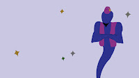
To begin with I created 3 different pieces of artwork based around my chosen story of Aladdin. One scene that would be the first 5 seconds, a wipe scene, and a second scene for the last 5 seconds. Here is what I created in Illustrator:

I then imported my illustrator artwork in to after effects and added some animation to my assets, as well as adding type, which I added an animation preset to. Once I had done this for each scene I then rendered all the compositions. Then in a new project I imported the work as footage and moved the length of each piece of footage so the wipe scene was one second long and I placed this above the two other scene, overlapping them both, and made sure the size of the footage for the others scenes was 5 seconds.
After this I struggled a bit with the wipe transition and was unsure if I needed to apply a transition supplied by after effects or if there was an effect I could use on my wipe footage. In the end I decided to change the opacity, so it was 0% at the beginning and at the end of the one second and 100% in the middle of the second, to make the transition between the first and second scene obvious but not too harsh. I am still unsure if this is the correct way of doing it but visually it works okay, even if it is not the best.
Here is what I managed to produce:
Overall, considering I completed this task on my own I think visually it kind of works, although it is a bit basic, and maybe the animation skill could be better and improved. One thing I am pleased with is how I now feel a bit more confident working with after effects as I took some time with the software and had to do some things twice, which gave me practice.

