Friday, 18 March 2016

Visual Appendix Proposal


Essay Abstract:

This essay will focus on the recent revival of the handmade within the area of Graphic Design, covering specifically the resurgence of hand-drawn illustration as well as the rise in craft based processes like paper cutting, letterpress, screen printing and the overall hand-made aesthetic that is regaining popularity in the world of Graphic Design. The reasons behind this revival will also be considered, taking in to account the effects of technology and of the mass production trend brought about by industrialisation, which influenced the ideas of the modernist movement, and also looking in to the recent desire for a return to design that is concerned with the individuality and authenticity that comes with handmade processes, and design that is not solely screen based. This essay will also cover the ways in which the handmade aesthetic has been adopted in recent years on the commercial front, for example, in magazines of all genres hand-drawn illustrations are now regaining popularity in place of digital photography.


Visual Appendix – Aims and Objectives:

The design outcomes I want to achieve are a set of experimental works based around the area of my practice that I am most interested in: the handmade, and craft based processes. From looking at the ideas/issues raised in my essay, my aim is to recreate the digital imagery and text that is featured in commercial magazines, focusing on magazine covers, but using only analogue mediums/materials and hand-based processes.
 My chosen aim is a reaction to the idea that as a designer of the future I am to consider the relevance of the handmade within my practice, and I have chosen to do this through looking at a popular print-based artefact that today is mostly comprised of digital imagery, and is quite a prevalent area for graphic designers to employ their skills in terms of editorial and layout design.


Typical magazine shelf featuring the magazines that have employed the use of digital photography for an eye-catching front cover [photo]


Visual Appendix – Methodology:
-         
*  -The hand has to be employed in all areas of the creation
- - The only materials that can be used are analogue mediums, for example; pencil, ink, thread, paper, card, paint…
-          
  - Each experimental work will demonstrate a different process that has it’s principle based in a specific craft skill
-        
    -  At the beginning of each experiment a suitable and appropriate magazine cover will be selected, featuring digital photography to be recreated using handmade processes


Visual Research Question:

To employ handmade processes to recreate imagery that has been created digitally, considering how craft based skills can be relevant to designers of the future.


Keywords:

Handmade, Illustration, Craft, Process


Friday, 11 March 2016

Representation in Animation

Specifically - female representation and women in animation theory and context.

Animation industry - rare presence early on -> operated under pseudonym circa 1930s- 1940s.
Lotte Reiniger, May Ellen Bute
Begins to pick up in the 90s - managerial level 
-cartoon network
-TNT international
-CBS daytime children
-Fox kids network
-Disney channel

Animate context - problematic in terms of sexuality within animation.

A lot of women in animation theory - Maureen Furniss, Suzanne Buchanne, Jayne Pilling

1941 - Disney worker's strike - made animators worried that female workers were being trained to take their jobs

Sam Griffin - 'The Illusion of Identity: Gender and Racial Representation in Aladdin'   in Maureen Furniss' animation art and industry

Reproduction of gender roles within animated content ->

-shapeshifting for animated/comic effect
- transforming at whim of animator
- These 2 tendencies mirror philosophical/sociological approaches to identity
- 1930s turn towards 'realistic' human forms -> Disney 'believable' 'natural' movement.

Illusion of life

social constructionist perspective - (performative paradigm)

Gender created through social institutions/situations - not biologically inevitable - also applies to - racial/ethnic identity, masculinity, heterosexuality
|
began in feminist writing - case studies of Aladdin 1992

.
.
Snow White - typical rotoscoping form vs seven dwarves form.
- distortions in rotoscoping
-standard form in Disney

Animator's brief: create 'appealing' yet 'realistic' characters -> Frank Thomas and Ollie Johnson (principle of animation)
.
.
. context of appeal - 'your idea is drawn to the figure' - 'it is held there whilst you appreciate what you are seeing' ->  rotoscoping snow white, Belle, Jasmine, Cinderella, Alice, Ariel
-
- overly gendered drawing emphasise the process

* Laura Mulvey -> feminist theory -> films from straight male perspective - male subjectivity - way in which camera explores a scene - female figure objectified -> large head, small torso.

rotoscope not straightforward representation at all

rotoscoping make characters:

- prince charming - wooden, lacking in appeal - animators worked endlessly on the creation of snow white's appeal - Disney prince typically only has a few minutes of screen time 
:

Pinocchio and Peter Pan are exceptions to the rule but their masculinity is problematised : wooden toy - 'I'm a real boy'

- Peter Pan - sexual ambiguity of persona - Neverland - traditionally played by a woman in stage productions

- Merida in Brave - resists female socialisation - presented much more real - interesting thing in merchandise -> Merida dolls originally showed her in traditional princess gown and features slimmed down -> transformed 

Considerations of representation (Paul Wells)

Who made the product?
For whom was it made - in what year and in what historical context?

What political forces came between creator and audience?

What is the spectatorship in general? How do people derive pleasure from it?

How is the researcher qualified to speak to the group they claim to represent?

Who's standards are being employed in the analysis? 

Monday, 7 March 2016

Analogue Communique Development

Following on from last terms physical studio typography sessions, I found a book in the library called 'Hand Made Type Workshop' by Charlotte Rivers and thought it would be interesting to try out some techniques/ typography styles shown in the book and apply them to the phrase I had to create - 'I am...'. 

This is the tutorial I decided to follow from the book as I thought the use of the cut up squares of pastel coloured paper created a good effect, and also because it is quite different to the hand lettering I did for my work produced in the session.
.
.
.

.


I started off by printing out sheets of coloured paper, and then cutting out squares of a similar size.


This is the final outcome featuring my message I created in last terms session:


I like how the squares of paper give a pixelated effect to the letters and think the colours work well together.

Thursday, 3 March 2016

Animated Info-graphics


The focus of this After Effects session was to create an animated info-graphics piece of work, based around a fairytale/story of our choice. As I was absent from the session I asked what the techniques covered in the session were and what type of outcome we were expected to produce. The two new techniques covered were 'tilt shift' , where the composition slightly tilts, and wipe transitions. I applied the wipe transition to my work but not the tilt shift effect as I did not feel that it worked within my animation. 

Starting out, even though I had received an explanation of the session, I was unsure whether I would be able to create something in After Effects from the start, on my own, as I wouldn't say I am completely confident with the software. I tried to prepare artwork in Illustrator that I was happy with so that if the animation side of things wasn't too good at least the artwork would look OK. 

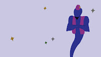
To begin with I created 3 different pieces of artwork based around my chosen story of Aladdin. One scene that would be the first 5 seconds, a wipe scene, and a second scene for the last 5 seconds. Here is what I created in Illustrator:


I then imported my illustrator artwork in to after effects and added some animation to my assets, as well as adding type, which I added an animation preset to. Once I had done this for each scene I then rendered all the compositions. Then in a new project I imported the work as footage and moved the length of each piece of footage so the wipe scene was one second long and I placed this above the two other scene, overlapping them both, and made sure the size of the footage for the others scenes was 5 seconds. 

After this I struggled a bit with the wipe transition and was unsure if I needed to apply a transition supplied by after effects or if there was an effect I could use on my wipe footage. In the end I decided to change the opacity, so it was 0% at the beginning and at the end of the one second and 100% in the middle of the second, to make the transition between the first and second scene obvious but not too harsh. I am still unsure if this is the correct way of doing it but visually it works okay, even if it is not the best. 


Here is what I managed to produce:


Overall, considering I completed this task on my own I think visually it kind of works, although it is a bit basic, and maybe the animation skill could be better and improved. One thing I am pleased with is how I now feel a bit more confident working with after effects as I took some time with the software and had to do some things twice, which gave me practice.