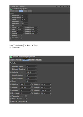
I am still getting to grips with Cinema 4D and at times in the session I found it hard to keep up, also differently from last time I didn't take as many notes so that I had more completed work by the end of the session. Also I ended up getting lost on the third experiment task so that remains unfinished until I find time to revisit it.
Monday, 22 February 2016
Cinema 4D Second Session
This session focused on experiments exploring Dynamics in Cinema 4D. We were shown three different techniques each with a different visual outcome. As there was a lot to take in within the session I have documented most of the steps I took through screenshots, which can be seen below.
Monday, 15 February 2016
Donald Judd - Specific Objects
Brancusi - most famous sculpturist of 20th century

Jasper Johns, False Start, 1959
 literalising colours - colous as words
lack of depth vs Cezanne - illusion, depth, colour can be abstract

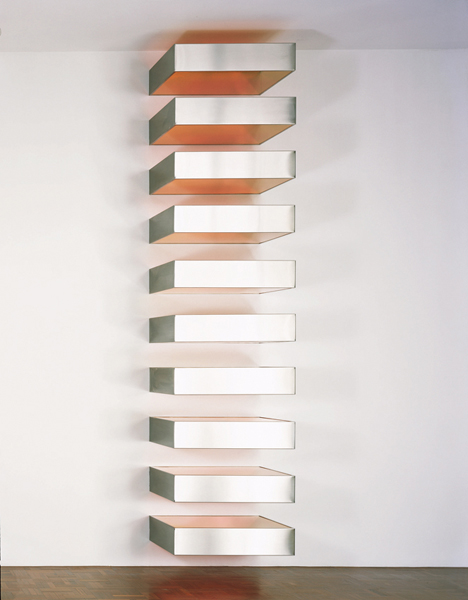
Judd - a 'specific object'
Painter Carl Andre not using square format of square canvasses. Removed the subject. Metallic paint.




Jasper Johns, False Start, 1959

lack of depth vs Cezanne - illusion, depth, colour can be abstract

Judd - a 'specific object'
Painter Carl Andre not using square format of square canvasses. Removed the subject. Metallic paint.

Judd - recognition of industrialisation
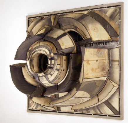
Lee Bontecou, sculpture/painting 'specific object'

Yayoi Kusama - compulsion furniture (accumulation) 1964
going beyond specific object, neither painting nor sculpture

Judd's essay 'specific objects' mentions these
Claes Oldenberg, small yellow pie, 1961
what is it?

very specific object
Dan Flavin - 1963, pink out of a corner, flourescent light

Claes Oldenberg - giant light switch made of vinyl

Judd 'Relief' 1961

Judd, Untitled,1967

Tuesday, 9 February 2016
Visual//stylistic references for animated infographic workshop
These are some stylistic references I have gathered for my upcoming animated info-graphics session.
Depending on what kind of info-graphic we are to make hopefully some of these visual references will help my design.
Coffee Consume from Rodel Borja on Vimeo.
TakePart: Participant Media - Waiting For 'Superman' - Infographic from Jr.canest on Vimeo.
Bill Gates: How online courses can radically improve education by 2030 from Ivan Kander on Vimeo.
Analogue Communique 3D
The objective of the brief for this term's physical studio process & production sessions is to create three dimensional typography to communicate a message. We are expected to be creative and think about how the meaning of the message informs the content and structure our creation. The output is to be physical and we are to record the build of our work and document all stages of our design process.
For this first session the focus was on idea generation, and we had to create at least two ideas/possible solutions.
To help with my ideas I created two mood boards of visual references:
From gaining inspiration from the visual references I acquired I then started to think about what word I would use for my creation, bearing in mind the materials I could use for the word, and how this would communicate a message.
These are some of the ideas I had:
* Sharp made out of pencil sharpener shavings/ pencil shavings covering 3d letters made from cardboard
* Create made out of various tools for creating a piece of work
* Healthy made out of fruit/vegetables/food
* Sweet made out of confectionery/sugar
* Strike made out of matches
* Vintage made out of vintage ephemera
* Get a grip/gripped/gripping made out of hair grips
* Explore made out constructed map paper
* Bitter made out of lemons/ lemon peel
* Stressed made out of thread/cotton placed in a chaotic fashion
* Recycle made out of recyclable materials
* Make made from tools used to make something
* Crafty made out of crafts supplies
* Grow made from flowers/plants
From these ideas I tried to think what word/message would be best and found it quite difficult to decide what was a good idea and what was not so good. Before the next session I will have tried out at least 2 of these ideas/ any better ideas I think of.
For this first session the focus was on idea generation, and we had to create at least two ideas/possible solutions.
To help with my ideas I created two mood boards of visual references:
These are some of the ideas I had:
* Sharp made out of pencil sharpener shavings/ pencil shavings covering 3d letters made from cardboard
* Create made out of various tools for creating a piece of work
* Healthy made out of fruit/vegetables/food
* Sweet made out of confectionery/sugar
* Strike made out of matches
* Vintage made out of vintage ephemera
* Get a grip/gripped/gripping made out of hair grips
* Explore made out constructed map paper
* Bitter made out of lemons/ lemon peel
* Stressed made out of thread/cotton placed in a chaotic fashion
* Recycle made out of recyclable materials
* Make made from tools used to make something
* Crafty made out of crafts supplies
* Grow made from flowers/plants
From these ideas I tried to think what word/message would be best and found it quite difficult to decide what was a good idea and what was not so good. Before the next session I will have tried out at least 2 of these ideas/ any better ideas I think of.
Thursday, 4 February 2016
Using Cameras and 3D Space in After Effects - development work
Following on from the session I decided to develop my piece of work by making the 'London Eye' object within my video clip rotate. To do this I reopened my original Illustrator artwork file and added another layer. I then copied the 'stand' of the wheel and pasted it on to the new layer, deleting the original stand on the other layer. Now with the wheel and wheel stand on separate layers, I would be able to rotate the wheel itself in After Effects.
At first I thought about how I would get the new Illustrator artwork in to After Effects and was unsure about how to do this. At first I tried to just replace the footage with the new Illustrator file but that did not work, and after a few attempts I did it by keeping everything the same but just importing the new Illustrator file with the wheel layers separated in to the comp as well, - retaining the layers- then dragging the wheel stand layer in to the timeline. I then pre-composed the layer so it had the same texture fill as the wheel layer. I also made the layer so it could be manipulated in 3D space like the other layers by selecting the cube icon.
To rotate I went in to the transform drop down and selected the rotate in Z axis, and added a key frame at the moment the wheel came in to focus, then moved the playback head to the end and added one there too. At first I changed the end rotation value to 360 degrees, but as the wheel was turning too fast (I wanted it to be slower as it is the London Eye) I adjusted the value until it was at a speed I thought worked best.
Here is the outcome of my developed work:
3D work in After Effects rotating wheel from Libby Howker on Vimeo.
One thing I am pleased with is how I managed to work with After Effects on my own and figure things out without instruction as I feel not very skilled in using After Effects, and I am also pleased with how the rotation works in the first moments you see the wheel, but then I feel because of the carriages attached to the wheel spokes, the rotation movement looks a bit odd and the angle doesn't really look right. Also at one point the wheel stand looks as though it is not connected to the wheel when the camera is pulling back which is something that would need to be fixed if I revisit this.
Subscribe to:
Comments (Atom)


