Wednesday, 25 March 2015

Typography workshop


This workshop was all about creating an alphabet and creating our own font from drawing out letters in different styles and then picking our strongest letter designs to create a more consistent font of one style. We were also asked to think about what our fonts would be used for when creating our alphabets.


Here are my initial letter designs done using pencil:


From looking at these different letter designs I felt the ones that worked well and I liked most were the script/loopy type letters and also the ornamental/decorative type letters which were inspired by vintage typefaces I have seen, and reminded me of typography used to advertise a circus or fun fair.
I decided to do a full alphabet using the script letter designs and here was the result which I felt looked quite art-nouveau in it's appearance although this was not a conscious decision.


For this we did both lower and uppercase letter designs, and to make the font work and the letters correspond I tried to put a loop in every upper-case letter and then made the lower-case letters more focused on the curves of the terminals. 
Once I had created a full alphabet I then began to draw the letters on a larger scale using grids:


I found using the grids quite challenging as my letters feature lots of curves and loops which were quite hard to draw within the rigid grid format. 

Overall I enjoyed this workshop as I am interested in and really like hand-lettering and creating letter designs and fonts by hand, and found the freedom of the workshop nice to be able to create a font from my own inspirations and have fun with designing an alphabet without too much pressure on measurements being perfect, but also then thinking about what my created typeface could be used for, for instance my font is quite cursive so could be used as a title or heading font.

Monday, 23 March 2015

Bauhaus Film

In the lecture today we watched a film all about the Bauhaus and were asked to answer the following questions:

1. a) Which key ideas constituted the Bauhaus philosophy?

-Many avant garde ideas
-Functionality
-Modernism
-Architecture, painting, sculpture, design all linked together
- Abstraction taught
- Put the idea of community in to practice - theatre
- Photography exploited as visual communication
- Early expressionist Bauhaus -> constructivist Bauhaus

b) In what ways were these ideas innovative or new?

- Constructive thought
- First time design had been taught coherently in art context
- Freedom for artists

2. How was art education revolutionised under Bauhaus principles?

- Workshop based training
-Learnt about individuality of students at college
- Politically radicalised students


Wednesday, 11 March 2015

Timeline of Design

As a seminar task we were asked to consider making a timeline of key movements/figures in design. Here is mine:


I have used fonts from the movements mentioned and included dates of how long each movement lasted, one thing which could improve it would be to include important events that were happening in the world alongside these events to see how these design movement were reacting to that.

Monday, 9 March 2015

The Propaganda Poster


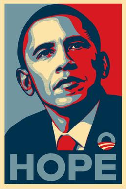
In this lecture and the following seminar we looked at the features of the propaganda poster. Propaganda posters can be seen as visual communication, and were used frequently during periods of war, but a more contemporary use is in advertising campaigns and social media, an example being the 'Hope' Obama poster: 


One feature of the propaganda poster that we looked at is fists/ the hand being used as a motif. It is a narrative motif which has a symbolic significance and can symbolise revolution or solidarity, an example being when it was used by black athletes to show solidarity against racial discrimination. 


This made me think of the current protests going on against racial discrimination in Ferguson in America, where the 'hands up, don't shoot' has become a frequently used saying or gesture and has come to feature on the posters held by demonstrators, as well as being picked up many notable figures including  several players on the St. Louis Rams football team:


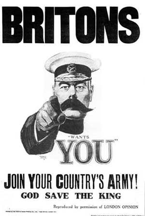
Realism vs abstraction is also something considered within the propaganda poster. An example of a well known poster is Alfred Leete's 'Britons, Lord Kitchener want you' which falls under the realism category. A variation on this was James Montgomery Flagg's 'Uncle Sam wants you'. 


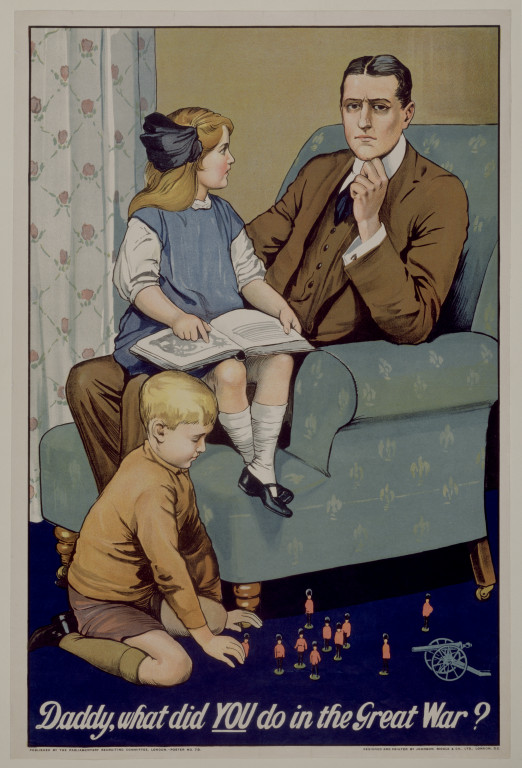
Propaganda posters in the war also used manipulation and emotional blackmail as tactics to get people to sign up to the army. One example of this is Saville Lumley's 1915 poster 'Daddy, what did you do in the Great War?' this title serves as a guilt trip in to making men sign up to the war in order to make them feel like they have made their family proud and not seen as invalid or a coward for not participating in the war. 


In the seminar we were asked to think about how the example from the magazine plays on the viewer’s emotions to achieve its effects and to consider both its content and stylistic approach. It definitely plays on the viewer's emotion by including children in the image, and also the way the daughter's face is looking at the dad figure expectantly, who is looking at the viewer, making it feel like the question is being directed at the viewer. Also, the stylistic approach is quite realistic which makes the viewer be able to relate to the message more.

Atrocity propaganda was another type of propaganda and unified people in fear. It mobilised public opinion against Germany by giving some false information, and tried to justify conflict. It was also emotive and sensationalised the war. An example being Frank Brangwyn, 1918:


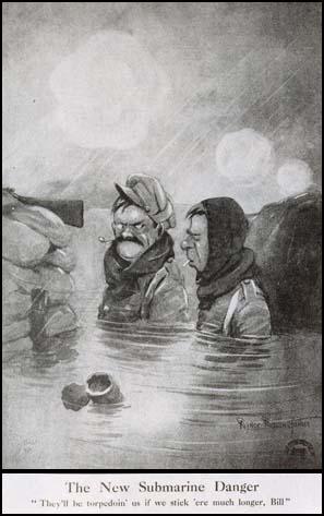
Humour was also used in propaganda posters by artists such as Bert Thomas and Bruce Bairnsfather.


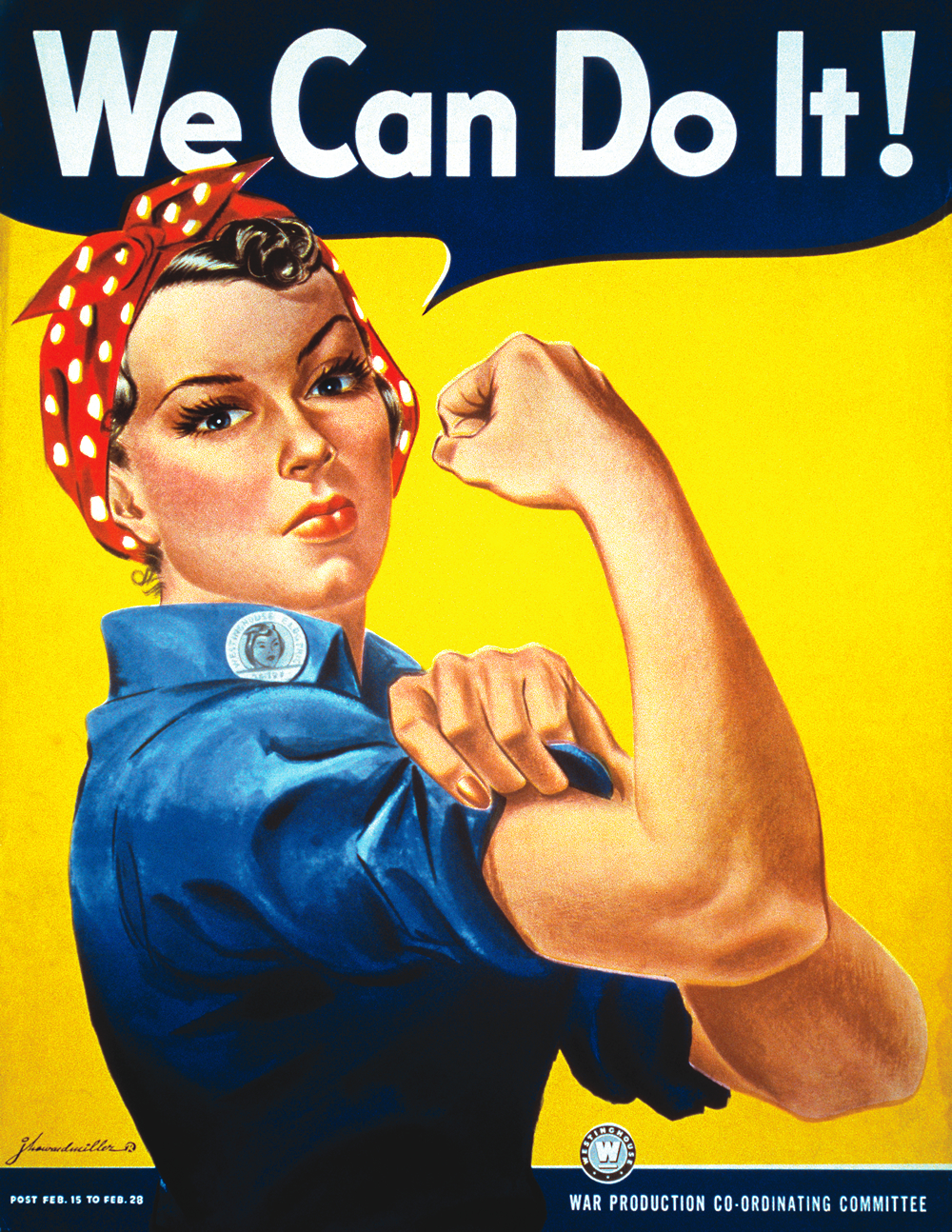
We also looked at the depictions of women in propaganda posters. The ideal role in Nazi Germany was to stay at home and be a mother. Women were often depicted as 'larger than life figures' and there was a return to Victorian ideas of domesticity and work. Probably the most well known propaganda poster is the 'We can do it!' 1942 poster by J.Howard Miller:


In recent years this poster has been reproduced, appropriated and become used as part of the feminism and women's rights movement, however some see Rosie the Riveter as being the image of a feminist highly problematic. This is due to many reasons, including the fact that Rosie the Riveter was created by a man to encourage women to participate in the war effort by working in factories, but being paid 50% less than men and were still expected to carry on with the housework as well. Many also see this character as no longer representative of what the working woman is today, and many have tried to show more representation on the appropriated posters:


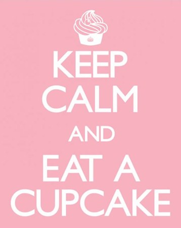
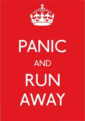
Another well known propaganda poster that has been reproduced ad infinitum is the 'Keep Calm and Carry On' poster:

 Original                       

                                                                                        Contemporary designs

Three of the main themes of propaganda posters were the idea of comradeship, romantic adventure, and that soldier equaled heroic warrior.