Monday, 23 February 2015

Kinetic Typography

    In preparation for this session we had to select a piece of text - anything from lyrics of a non-copyrighted song, to a few lines from a book or a spoken recording, as long as when it was spoken out-loud the piece of text was ten seconds long, as that was going to be the length of the animation. The piece of text I chose was a few lines of dialogue from Harry Potter and the Philosopher's stone, which I chose because I felt it was quite expressive and would work well when animated. 

The first thing we did in the session was to write the text and split it up in to three sections, which for me looked like this:

Wingardium Leviosaa!
/

Stop! Stop! Stop! You're going to take someone's eye out!
/

Besides, you're saying it wrong. It's LeviOsa, not LeviosA.
                                                     
                                                        *

After we had done this we set up a board in Illustrator, with the width being 1920 pixels and the height being 1080 pixels, as this is the HD measurements that are the standard measurements for screen, and the colour mode being RGB as what we were making was intended for screen. 
          
We then used the rectangle tool to add a solid colour background, making sure this was the same size as the board, and then created two more of these by selecting the alt key and dragging. We then used the type tool and created a design we thought worked well, choosing an appropriate font and not making the font size any smaller than 50pt. 

After this we set up a new comp in After Effects with the 1920 x 1080 measurements, frame rate 25 fps, and duration being ten seconds. We then selected the text tool which made a text layer appear on the timeline, and copy and pasted our text in from Illustrator. After this we selected a colour for our background, and then to make sure our text would look right we chose the 'grid and guide' options the selected 'Title/Action Safe' and ensured all text sat inside the text safe box.

Once we had done this we started to edit the material, using key-frames. We looked at motion blur, which softens the blur effect when type moves in a frame, to do this you select the toggles switches and modes and then click the icon of the circles with circle trails behind it. Also, when the key-frame icon is a diamond it means the speed is constant from one point to the next. 
As well as this we covered 'easy ease-ing' in and out of key-frames to make the motion more gentle.

We then looked at how to animate individual characters, but were told to use this effect sparingly if we were going to use it. To do this, you select the text layer, go to the animation layer - apply animation preset- then navigate to prests - After Effects - presets - text - Fade on. This fades on each character. 

Here is my kinetic type clip:


Overall I am fairly happy with how the elements of type I animated worked out, but think this piece of work could be edited and improved with all the elements of text being animated in some way to make it more interesting and visually exciting. Also if I did this again I would save each word on to a separate text layer as I think animating each word makes for a more dynamic style and also makes it easier to apply different effects and create a desired movement. 

Art Nouveau

In the Art Nouveau lecture we looked at how the movement is often viewed by some as the first self-conscious attempt to create a modern style, and is seen as the predecessor to a modern style. We also looked at how Art Nouveau permeated all areas of culture and how nature was a main influence in the movement, with butterflies, flowers, leaves, vines, peacocks and insects all being included in Art Nouveau pieces of work, and also the importance of the curved line. 
Some artists working within this style were Alhonse Mucha, Aubrey Beardsley and Joseph Satter - with the latter two artists demonstrating the Japanese influence on Art Nouveau. 'Mythical' looking women were often used as motifs in this style, with Art Nouveau posters featuring symmetry in the background but the foreground was unsymmetrical. 


Here is a piece of Art Nouveau design by Alphonse Mucha.

When looking at these artist's work I was reminded of work by a contemporary illustrator who I have liked for a while now, called Miss Led, and whose work mainly features colourful illustrations of women - one of the features of the Art Nouveau style, as well as this nature plays a prominent part in her illustrations and as seen in many contemporary design that is unfluenced by art Nouveau, a frame is often featured.  


Above: Miss Led illustration, the frame shows Art Nouveau style influence, as well as the colour scheme.


Huddersfield Art Gallery Visit

 The purpose of this this gallery visit was to look at the Cybernetic Serendipity exhibition mainly, but also look around the other exhibitions and consider the questions on the worksheet we were given, which related to the theory lectures and seminars over the past three weeks.

Here are some photos I took from the Cybernetic Serendipity exhibition:


Within the exhibition there were various methods of visual communication, such as books, type, images, photos, digital - films on a computer and tv screen, and publications. The most effective form that had the most impact on me as a viewer would be the Cybernetic Serendipity films shown on an old computer monitor, as I felt like the use of this media channel linked well with the theme of the 'cybernetic' and worked better somehow than if the films had just been shown on a really modern computer system. 


One of the questions we were asked to consider was whether we could identify examples of semiotic meaning-making and to look for any examples of symbolic, iconic or indexical signs in the works of the exhibition. One piece of work that I found included such examples was a work called 'Running Cola is Africa' which featured the icon of a running man turning in to the icon of a coca cola bottle, morphing in to the continent of Africa. 


When looking at the other exhibitions in the gallery we were asked to look at the different types of paintings different ways as many of the works were abstract and some appearing more narrative. A painting I chose to look at and think about how I might 'read' it from an iconographical/iconological perspective, and what it 'means' to me was Jo Brown's 'Channel': 


When looking at this painting I thought that the symbols on the right looked like basic bird drawings, while the right side looks to me like a a boat on the sea. 

Overall I found the Cybernetic Serendipity exhibition somewhat interesting, and liked some of the works featured within it but also felt a bit unsure as to what the meaning of it was meant to be and felt a bit confused by it all, which may be due to the exhibition being quite text heavy, and also as I got told after I had seen the exhibition, that it was actually a documentation of an exhibition of cybernetic art curated by Jasia Reichardt, shown at the Institute of Contemporary Arts, London in 1968. Also though, my confused response to the exhibition could have been the intention, due to all the different media channels going on and the repetitive noise of the films being played along with the complex algorithms featured on the walls.

Sunday, 22 February 2015

Typography in Graphic Design - Task 2

For the second task we had to draw up three rough alphabets from our initial shapes and letter forms, and then think about which one will be most appropriate to take forward to task 3. 

Here are my 3 alphabets inspired by my initial letter forms transcribed from El Lissitzky's work. 


To create these alphabets I used a pencil and a ruler and then outlined in a black fine-liner pen. For task 3 I will have to choose the alphabet which I think the best, to do this I will select my best letter from the 3 designs, and will have to make sure each letter looks like part of the same typeface, and the designs of the letters correspond well with each other. Also each letter should probably be the same height and the line widths the same to make it look neat.


Iconography & Iconology

 In this seminar the focus was on Iconography and Iconology, the same as the lecture before it. 
Iconography being - the study of symbols depicted in a work of art or design
         - identification and description of the content of images
         - traditionally these symbols derive from a readily recognisable, common currency of cultural experience. 
Iconology being - the study of meaning contained within these symbols; the intent of the content of the images.
                        - branch of art history that addresses descriptions, analysis and interpretations of images.
                        - looks at more than the face value of the symbol, taking in to account it's context, both historically and culturally, as well as in relation to the artist or designer's broader oeuvre. 

We also looked at metaphors, including visual metaphors, - a type of analogy where meaning is derived through association, comparison in resemblance. Equates two things in order to make and impact.

The seminar task was to re-organise primer illustrations to make different narratives, we could use the wording provided or add any additional words we felt necessary to complete the short story-line. We watched a short animation which had done just this to create quite a dark narrative using the simplistic primer illustrations. 


Here are the short stories I created using the above illustrations: 


It was quite hard to make narratives that were logical using only the illustrations and I had to add in words and join together illustrations to make new words, for example joining 'ink' and 'jar' to make ink-jar, and 'tree' and 'swing' to make tree-swing. It was interesting to look at iconography, and how meaning is applied to symbols through the identification and description of the content of the images, and how the task showed that multiple interpretations can be made from looking at the same symbols to create different narratives.


Saturday, 21 February 2015

InDesign Tutorial - Type

   In this session the focus was on laying out and structuring type in a document. We looked at issues in text like widows and orphans, and rivers and how to avoid these so that when we create our own documents they are formatted in a way that is easy to read and not distracting from the text itself. The first task was to create a publication on InDesign, what it was based on was not important as it was just to see how we would format text in a document initially. We were then told about some mistakes and issues that were visible in our work and how to avoid these.

  One thing we looked at was hyphenation in text, and using Paragraph Style options to select words to hyphenate and choosing how many characters to hyphenate after, as too many hyphens in a paragraph can look distracting and uneven. We then were shown how to set up a style to one paragraph bye going to Type - Paragraph Styles - Create New Paragraph styles - Name.

Another thing we looked at was indent and spacing and selecting space after 4 mm and choosing the left justified alignment. Then how to apply styles on text by selecting the text tool and clicking anywhere on the text and then selecting all. After this you hold down the control key and click on 'Subhead' to edit the subhead.  We then looked at Paragraph Rules and 'offset'. 

Additionally we were told how to wrap text around an image which I found useful. You select the clipping path around an object, select the text wrap window and then space it appropriately. To use these text styles and paragraph styles we set up a document using given text and images, that we had to place in to the document. 


This is one of the pages of the document in which a Paragraph Style has been used which can be seen as there are visible subheadings which are underlined and the style is consistent. Also visible in the top right hand corner is a 'drop-cap' which was created by selecting New Paragraph Style - Dropcaps and nested styles - lines 3 - 1 character - new character style - 'big letter'. 

We also learnt how to correctly use a Style to create a contents table: 


To do this we selected layout - table of contents- title - style: TOC title. We then added the Subhead style to this bit of text also. We were then shown how to create the dots - or 'Tabs' - between the numbers and page headings by creating a new paragraph style and selecting the type - tabs, and when doing the leaders we changed the leaders to a smaller type size so it looked neat. 
We then applied tabs also to another page along with the other created Styles.


Overall I found this session quite useful as I have not had much experience on InDesign, and learning how to employ Paragraph Styles in a document with multiple pages where everything has to be consistent is useful.

Tuesday, 17 February 2015

Semiotics


In this seminar we looked at different adverts and how semiotics were used in them, and also explored further the semiotic content covered in the lecture beforehand. 
In this lecture we looked at how semiotics is fundamental to an understanding of how visual communication works and how text and images can be manipulated to benefit their messages. We also looked at how we are all participants in a culture which functions on the basis of shared meanings and common understanding, how we are able to read the world around us as a system of signs.
We also learnt about the two key approaches to understanding visual communication and semiotics, as put across by Charles S. Pierce and Ferdinand de Saussere. With Saussere focusing on phonemes, and Pierce focusing less solely on linguistics and more on how we make sense of the world through senses and experiences. We looked at how linguistic signs are inherently arbitrary, and how Pierce defined the three categories of signs: 

Symbol - arbitrary (Signifier) E.g. Words, flags, alphabet
Icon - Resembles the sign, likeness (Signified) E.g. Onomatopoeia 
Index - direct link between sign and object, logical, causal connection (Sign) E.g. Smoke is an index of fire

We also learnt about how semiotics relies on common understandings and culturally shared conventions, even when the signified is absent, the sign can still be meaningful in certain contexts, one example of this is the Heinz Ketchup advert, where the Heinz ketchup bottle is missing, but due to common understandings and shared experiences we know what advert is for:


  In the seminar we focused on semiotics being used as a form of social criticism, to examine and explore the motivations behind these constructions of meaning.
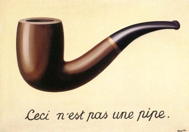
The first thing we looked at was Rene Magritte - The Treachery of Images (1928-29).  His painting of a pipe highlighted that a painting is a mere representation of meaning - just an image of a pipe created from paint and canvas, and relies upon the viewer's shared understanding with the artist that this is the object to which we have allocated the name or signifier 'pipe', looks like. 


The painting features the sentence 'This is not a pipe' to show that Magritte is commenting on how we perceive and make assumptions on the things we see. 
    To follow on from this we then considered how semiotics are used in advertising to portray certain characteristics or ideas through carefully constructed representation, and how we read messages through this, when really the characteristic being associated with a product is merely us viewers perceiving and assuming something. 
We watched the Christmas adverts for Tesco, ASDA, Marks and Spencer and Sainsbury's and what messages were being communicated in each. Each supermarket's message was different, with Tesco's communicating togetherness and a positive outlook, whereas ASDA showed a more realistic, stressful side to Christmas and used the idea of Christmas being 'mum's responsibility'. Marks and Spencer communicated the message of Christmas being 'magical' using fairies, and Sainsbury's retelling of the WW1 football match communicated an emotive message and was probably the most effective of all the adverts because of this. Each advert played on shared experiences and cultural understandings from ASDA's 'stressed mum' message to Sainsbury's war story.

Speed and Motion

    This session covered key frames and animation in After Effects. In the workshop we were told how to use key frames to animate objects and layers. We also were told how to create motion using the different layout properties (rotation, position, scale etc), and how to work with vectors, parenting and motion paths. In the lesson we were asked to create a ten second animated sting using key framed motion.

Prior to the session we were asked to bring an asset with us, a design of a character or object made in Illustrator which we could then animate. Depending on Illustrator skill level your character could be complex or simple but I chose to create a simple illustration of a bird: 


For each part of the illustration we wanted to animate in After Effects, we had to save this to a different layer: 

After this I then named the layers to make it easier to identify each section when I imported the illustration in to After Effects. 

My illustration in After Effects:

 To get my illustration in to AE I chose the correct file and then selected retain layer size, and deselected sequence button. I then made the background transparent by clicking the checkerboard icon so that I could see all my assets.


We were then asked to use anchor points on each of our layers apart from the main body layer. The anchor points would be at the the main hinge point  where the asset would move from when animated. To move the anchor point I selected the dotted rectangle with a diamond icon.

Parenting

We were then taught about parenting; the action of connecting one layer and object to another layer and object. To do this you drag the spiral icon in the parent column to the layer you want to be the 'parent' - the layer you want the selected layer to follow around. I made the main body of my bird the parent layer to all other layers.


The next thing we looked at was using key frames. 

To activate a key frame we had to select the stopwatch icon, which then would mean a diamond shape would appear on the timeline. We then selected and dragged the keyframes to certain points on the timeline, and to create a motion loop we copy and pasted what we had done to fill the rest of the timeline to get 10 seconds of footage. 
To speed up motion, the key frames need to be closer together; to slow down motion, the key frames should be further apart. Using this we started to animate our character and making sure 1 layer worked correctly before animating the rest.  I found this part of the session fairly straightforward and enjoyed animating the different layers and seeing them move all together when playing back the timeline. 

Then we looked at the Position property, and using the 'jump' effect by selecting all the key frames and toggle holding the key frames. You could then modify the motion path created. After this we covered the Scale property and looked at the two different scale options - the x and y values.

We then created a new comp, set the frame rate to 25 fps with a duration of 10 seconds, and dragged our character to the new comp. We had to then create a background colour - a solid shape the same size as the comp, which I coloured blue to create a 'sky' background as I felt it appropriate for my character/object of a bird. For the foreground we created another shape the same size as the comp but a different colour, for the character to 'stand' on - I made mine green to reference grass.  We were then asked to select to different textures and apply these to the background and foreground. We then learnt about trackmats and how they convert layers to masks/mats. I tried out a few textures but found that the effects were not very subtle and didn't work well so opted to leave the foreground and background just as a colour. We then rendered our compositions and uploaded the low resolution version to vimeo. 

Here is mine:


Overall I am fairly happy with how my animation worked out, the movement could be smoother and maybe could have been a bit faster though. I mostly found the workshop quite easy to understand, which I think was because I made sure to write down Sara's instructions as she said them, and then reflect back and carry out the tasks, rather than try and do the task as we were being told what to do, as the instructions were quite lengthy and a bit challenging I found in some places.

Monday, 16 February 2015

Revolutionising the Image

 In this lecture we looked at 'style', Cubism and Futurism. The first thing that was discussed was 'The Canon', and we looked at the Doryphorus of Polycleitus sculpture in relation to this, as an example of all that followed being based upon a previous design, as all other sculptures made after this one were modeled on it. 


From previous study of classical history I know that an example of a sculpture being modeled after the 'canon' measurements of the Doryphorus of Polcleitus work was the Prima Porta statue - a statue of the emperor Augustus:


Following on from this in the lecture, we then looked at style. 'Style' being the aesthetic features of something, a reference to appearance. It can be used to categorise art pieces. The term 'sylised' means a certain look to an image. One interesting example we looked at was a work by Picasso called 'Woman and Child on a Seashore' , however from looking at the style of the artwork you would not have thought it was made by Picasso because it was not done in his well-known cubist style.


We then looked at Cubism, which was a movement started at around 1907 with Picasso and Braque considered to be the founders of Cubism. Features of the movement were intercepting lines, removed depth, with all different angles being featured and a geometric look. The different phases of cubism were also discussed. The first phase being known as 'Analytic Cubism' which was more austere, serious and featured a reduces palette. The second phase is known as 'Synthetic Cubism' and included elements of collage, a mixture of materials and the importance of text was demonstrated. Braque that it was not meant to be read, and invited readership while rejecting it.

 Analytic                                            Synthetic

It was then discussed how Analytic cubism inspired the De Stijl movement (1917-1931) as the movement looked at maths and geometry in perfect forms.

Lastly we looked at Futurism which was a movement that came about towards the end of Cubism, and it's manifesto written by Filippo Tommaso Marinetti. The futurist artist Franz Marc's work shows Cubism influences:


Wednesday, 4 February 2015

Typography in Graphic Design - Task 1

For this session we were asked to carry out a typographical task. Using references provided, featuring a variety of architects, designers and artists, we were asked to transcribe shapes from these to make letter forms and or typographic characters. The letters could be lowercase or uppercase but had to be a,n,e,s and g. We had to generate at least 3 different options from the image samples provided. 

The first image sample I used to transcribe letter forms from was Edward Wadsworth's piece 'Newcastle' which is a Vorticist piece of work. Vorticism was a short-lived modernist movement in British art and poetry of the early 20th century. It was partly inspired by Cubism.


Here are the uppercase letters I transcribed from this piece:


And the lowercase sample:

I feel the uppercase letters could reflect better the different elements of Wadworth's work and be more expressive as the letters are very basic. With the lowercase sample I tried harder to pick out shapes from the reference to turn in to letter forms.


My second typography samples were inspired my Milton Glaser's Dylan Poster Art - 1966. 


Here are my uppercase letters inspired by this piece:


As well as my lowercase letters:


I quite like how the uppercase letters look, but feel the lowercase letters could look better in terms of shape but I think that I have transcribed Glaser's work quite well here.

The third reference I looked at as inspiration was  ‘PROUN’ by El Lissitzky (1923). 

Here are my transcribed uppercase letters:


Here are the lowercase letters I transcribed:


I found that this piece lent itself quite well to formulating letters as it features many different shapes and angles, with a mix of curves and straight lines.

For my fourth typography sample I looked at a piece of work by Laurie Rosenwald. Although she already includes type in her work, I was interested in looking at the shapes and images to transcribe letter forms.


These are my uppercase letters inspired by this piece:


And my lowercase letter samples:


I'm not sure the letters I've transcribed from this piece work that well, especially the lowercase sample as the a looks more like an o, and although the uppercase letters all relate to each other and match up to Rosenwald's work quite well they're a bit basic and I could have probably produced more interesting designs. 

The fifth image sample I used was Herbert Bayer's work, I used both of these designs when constructed letters.


Here are the uppercase letters I transcribed from this:


And the lowercase letters:


Using this reference material to transcribe letters was the most challenging I feel, maybe due to the fact that I was transcribing images with a 3d perspective, but I also feel these letter forms are my most expressive and represent the reference material I used well.