We began by producing a series of thumbnails which explored title, image and layout potential. Thumbnail is a term used by designers and photographers for a small image representation of a larger image, usually intended to make it easier and faster to look at or manage a group of type and image layouts. While creating mine I looked at existing magazine layouts for inspiration to see what worked well. Here are mine below:
From these thumbnails I then experimented with different layouts on A3 paper using the text from my story that we had been asked to print in various point sizes and fonts to see which worked the best, also taking in to consideration room for images.
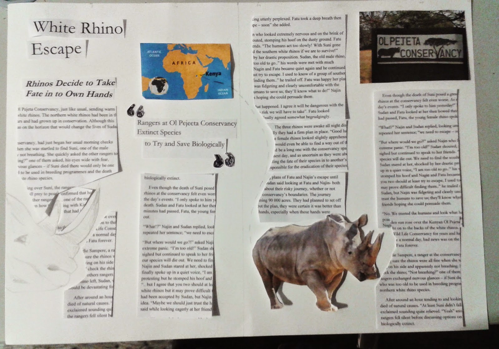
Below are my four layout designs based off my thumbnails, I decided to try 2 with a two column per page format and 2 with a three column per page format:
I think probably the ones that work best are the ones with the three column per page format, as the text looks better this way, separated in to smaller parts. The one I think that works the least well is the second one I did as I'm not sure that the image and text work well together on that layout, and there is a lot of white space, so the title could have been bigger.


